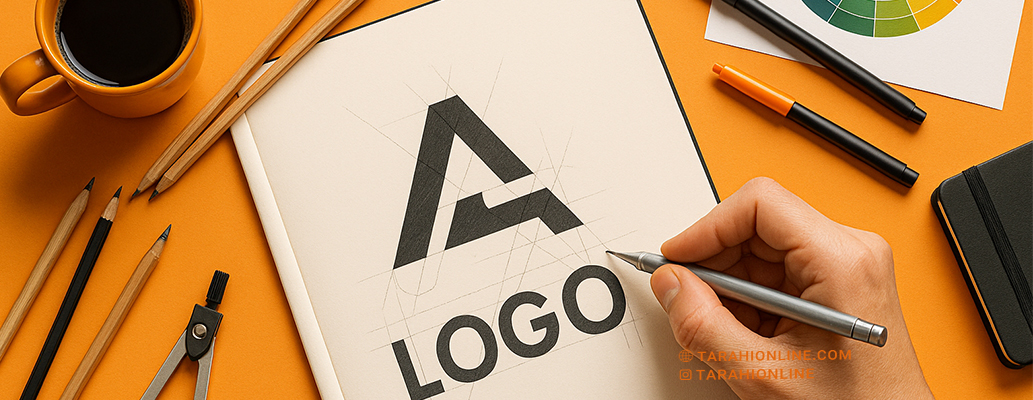
A logo, as the cornerstone of a brand’s visual identity, plays a critical role in capturing attention and conveying brand values. Designing a professional logo requires a blend of creativity, strategy, and technical expertise. A professional logo must be visually appealing, memorable, and perform well across various platforms while accurately reflecting the brand’s identity. In this article, we’ll explore key techniques for designing a professional logo.
1. Research and Understand the Brand
Before starting the design process, a deep understanding of the brand is essential:
-
Brand Identity and Values: Identify the brand’s core values, mission, and vision. The logo should visually communicate these elements.
-
Target Audience: Who is the brand’s audience? A professional logo should resonate with their preferences and expectations.
-
Competitor Analysis: Studying competitors’ logos helps highlight your brand’s unique differentiators.
Technique: Conduct interviews with the brand owner and use brainstorming sessions to gather insights. Tools like moodboards can spark inspiration.
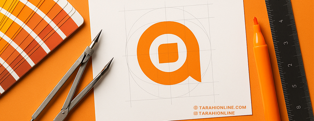
2. Simplify the Design
Simplicity is key to a professional logo:
-
Eliminate Unnecessary Details: Complex logos may not perform well in small sizes or digital platforms.
-
Use Geometric Shapes: Simple shapes like circles, squares, and clean lines create a modern, professional look.
-
Limited Color Palette: Typically, 1–3 colors are sufficient to maintain clarity and impact.
Technique: Follow the “less is more” principle. Test the logo at small sizes (e.g., app icons) to ensure it remains recognizable.
3. Choose Appropriate Typography
Typography plays a significant role in conveying the brand’s personality:
-
Sans-Serif Fonts: Ideal for modern, minimal brands.
-
Serif Fonts: Convey a classic, professional feel.
-
Custom Fonts: Create unique typography to establish a distinct brand identity.
Technique: Align the font with the brand’s style and ensure readability at various sizes. Avoid using more than two fonts in a single logo.
4. Use Strategic Colors
Colors evoke emotions and convey specific messages:
-
Color Psychology: For example, blue suggests trust and professionalism, red conveys energy and passion, and green represents nature and sustainability.
-
Color Gradients: Use soft gradients to add a modern touch.
-
High Contrast: Ensure the logo is legible on both light and dark backgrounds.
Technique: Use tools like Adobe Color or Coolors to select a cohesive color palette and test the logo in monochrome to ensure versatility.
5. Leverage Negative Space
Negative space is a creative technique that uses empty areas between elements to form hidden shapes or messages, making the logo appear clever and memorable.
Technique: Study successful examples like the FedEx logo (with its hidden arrow) to inspire creative uses of negative space in your design.
6. Design a Dynamic Logo
Dynamic or adaptive logos can change in different contexts, such as altering colors or shapes for social media, advertisements, or products.
Technique: Create a primary logo and develop variations (e.g., monochrome or simplified versions) for diverse applications.
7. Ensure Digital Compatibility
A professional logo must perform well across all platforms, from print to digital:
-
Vector Formats: Design the logo in SVG format to maintain quality at any size.
-
Multiple Versions: Prepare horizontal, vertical, and square versions of the logo.
-
Small-Size Testing: Ensure the logo remains clear in small formats like app icons or favicons.
Technique: Test the logo in various environments (websites, Instagram, business cards) to confirm its performance.
8. Draw Inspiration from Modern Trends
Certain design trends can enhance a logo’s professional appearance:
-
Minimalism: Remove unnecessary elements for a clean look.
-
Animation: Add motion to the logo for use in videos or websites.
-
Geometry and Symmetry: Use geometric shapes to create a sense of order and balance.
Technique:
Study successful examples like the logos of Airbnb or Nike to get inspiration from current trends—but don’t copy them.
9. Testing and Feedback
After designing the logo, test it with small groups of your target audience or customers:
-
Customer Feedback:
Gather opinions about how appealing the logo is and how well it represents the brand. -
Visual Comparison:
Place your logo alongside competitors’ logos to see how distinctive it is. -
Technique:
Use tools like SurveyMonkey or focus groups to collect structured feedback.
10. Storytelling Through the Logo
A professional logo should convey a story about the brand.
For example, Apple’s bitten apple symbolizes simplicity and innovation.
-
Technique:
Include elements in the logo that reflect the brand’s story, values, or history.
Successful Examples:
Brands like Nike, Apple, and Coca-Cola have logos that became global symbols through simplicity, strong typography, and strategic use of color. These logos are not only professional, but also memorable and versatile.
Creating a professional logo requires a combination of research, creativity, and attention to detail. By understanding your brand identity, using modern techniques like negative space and color gradients, and thoroughly testing the design across platforms, you can create a logo that is not only attractive and professional but also memorable. A professional logo is a long-term asset for your brand’s success.

The Tarahi Online graphic and logo design team, with over ten years of experience in professional graphic and logo design, is ready to assist you and bring your ideas to life. Contact us to submit your request or place an order.