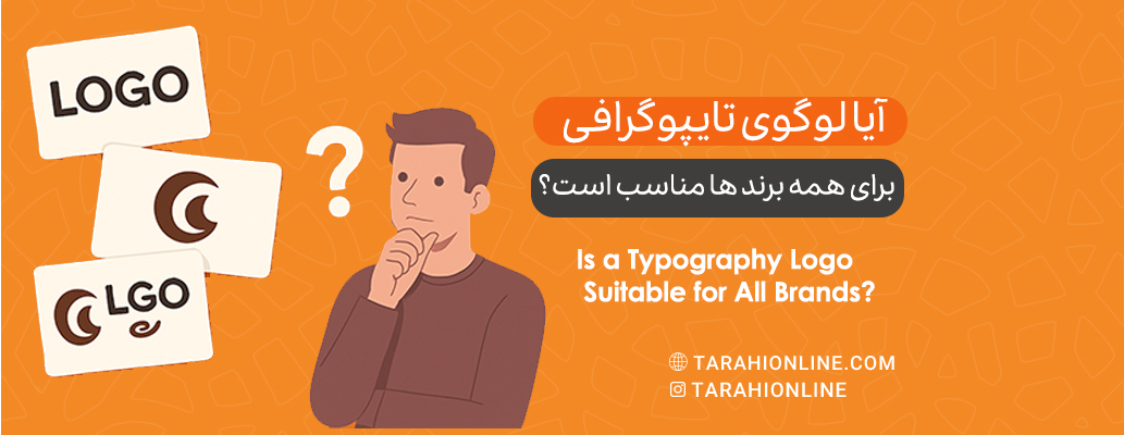
Typography logos, often referred to as wordmarks, are among the most popular styles in logo design. By focusing solely on text—typically the brand name—these logos leverage fonts and letter arrangements to convey a brand’s identity. Known for their simplicity, readability, and versatility, typography logos are a staple in industries ranging from fashion to technology. But are they suitable for every brand? In this article, we explore the characteristics, advantages, limitations, and applications of typography logos to determine whether this style is universally appropriate.
What is a Typography Logo?
A typography logo is a text-based logo that uses the brand name or a short phrase as its primary design element. Unlike pictorial logos (e.g., Apple’s apple icon) or combination logos (e.g., Adidas’ text and symbol), typography logos rely entirely on text. Iconic examples include Google, Coca-Cola, Nike, and Zara, each using a distinct font or style to reflect their unique identity.
Typography logos often feature custom or modified fonts to evoke specific emotions, such as modernity, elegance, or creativity. They can range from minimalist designs (e.g., Google’s sans-serif logo) to ornate, hand-drawn styles (e.g., Coca-Cola’s script).
Advantages of Typography Logos
Typography logos are favored for several reasons, making them a go-to choice for many brands. Here are the key benefits:
-
Simplicity and Readability:
By focusing on text, typography logos are highly legible, ensuring the brand name is immediately recognizable. This is especially valuable for new brands or businesses aiming to establish name recognition quickly. -
Versatility Across Media:
These logos perform well across various sizes (from business cards to billboards) and platforms (print and digital) due to their lack of intricate graphical elements. -
Cost and Time Efficiency:
Designing a typography logo is often faster and less expensive than creating pictorial or combination logos, particularly when using existing fonts. -
Strong Brand Identity:
With the right font and style, a typography logo can effectively convey a brand’s personality—whether professional, approachable, or luxurious. For instance, Vogue’s serif font exudes sophistication and fashion. -
Alignment with Modern Trends:
Typography logos align with minimalist and modern design trends, which have gained traction through 2025 for their clean aesthetics and digital compatibility.
Disadvantages of Typography Logos
Despite their strengths, typography logos have limitations that may pose challenges for some brands:
-
Dependence on Brand Name:
If a brand name is long, complex, or unappealing, a typography logo may be difficult to execute effectively. For example, a name like "International Business Machines" (IBM) benefits from abbreviation or a pictorial element. -
Difficulty Standing Out:
With many brands using typography logos, differentiation can be challenging without a custom font or highly creative styling. -
Limited Visual Appeal for Some Audiences:
Text-only logos may be less engaging for audiences drawn to graphical elements, particularly in industries like toys or entertainment. -
Challenges Conveying Complex Concepts:
Typography logos alone may struggle to communicate intricate brand stories or values, which pictorial or combination logos can achieve more readily.
Is a Typography Logo Suitable for All Brands?
To answer this, we must consider factors such as the industry, target audience, brand identity, and competitive landscape. Below, we analyze when typography logos are appropriate and when they may fall short.
Brands Well-Suited for Typography Logos
-
Brands with Short, Memorable Names:
Brands like Nike, Zara, or Sony with concise, catchy names thrive with typography logos, as their names alone carry significant weight. -
Fashion, Tech, and Professional Services Industries:
Typography logos are prevalent in fashion (Vogue), technology (Google), and professional services (Deloitte), where they convey professionalism, modernity, or creativity. -
New Brands or Startups:
Businesses in their early stages benefit from typography logos to prioritize name recognition and establish a clear identity. -
Minimalist and Modern Brands:
If a brand’s identity revolves around simplicity and clean design, a typography logo with a sans-serif or geometric font (e.g., Airbnb) is an excellent fit.
Brands Where Typography Logos May Not Work
-
Brands with Long or Complex Names:
Names like "Advanced Institute for Innovative Technologies" are unsuitable for typography logos, as they compromise readability and visual appeal. Combination or pictorial logos are better options. -
Visually-Driven or Child-Focused Industries:
In industries like toys, animation, or theme parks (e.g., Disney), pictorial or combination logos resonate more with audiences, especially children, who respond to imagery. -
Multicultural or Global Brands:
If a brand operates internationally and its name has varying meanings or pronunciation challenges across languages, a typography logo may limit recognition. Pictorial logos (e.g., Apple) transcend cultural barriers more effectively. -
Brands Requiring Storytelling:
If a brand needs to convey complex values (e.g., environmental sustainability), pictorial or combination logos (like WWF’s panda) are more effective.
Key Tips for Designing a Successful Typography Logo
To ensure a typography logo is effective and aligns with a brand’s goals, consider the following:
-
Choose the Right Font:
-
Sans-serif fonts (e.g., Helvetica): For a modern, clean look.
-
Serif fonts (e.g., Times New Roman): For a classic, professional feel.
-
Script fonts (e.g., Coca-Cola’s style): For creativity and warmth.
-
Custom fonts: For exclusivity and differentiation (e.g., Google’s Product Sans).
-
-
Prioritize Readability:
Ensure the logo is legible at small sizes (e.g., website favicons) and large scales (e.g., signage). Avoid overly decorative fonts that sacrifice clarity. -
Leverage Color Psychology:
Colors should align with the brand’s identity and audience emotions—e.g., blue for trust (IBM), red for energy (Coca-Cola). -
Mind Spacing and Alignment:
Proper kerning (letter spacing) and text alignment are critical for a polished, professional appearance. -
Test Across Contexts:
Test the logo on light, dark, and textured backgrounds to ensure versatility and visibility.
Typography Logo Trends in Recent Years
Based on recent design platforms (e.g., Dribbble, Behance) and trends through 2025, key typography logo trends include:
-
Geometric and Minimalist Fonts: Popular among tech startups for their clean, futuristic appeal.
-
Animated Typography: Motion-based logos for websites and social media.
-
Variable Fonts: Fonts with adjustable weights and styles for greater flexibility.
-
3D Typography: Adding depth and visual interest for creative brands.
Successful Typography Logo Examples
To illustrate the power of typography logos, here are a few notable examples:
-
Google: A simple sans-serif font with playful colors, conveying accessibility and innovation.
-
Coca-Cola: A classic script font that evokes nostalgia and warmth.
-
FedEx: A minimalist font with a hidden arrow (negative space) symbolizing speed and precision.
-
Vogue: A serif font that screams luxury and fashion.
Typography logos, with their simplicity, readability, and versatility, are an excellent choice for many brands, particularly those with short names, modern identities, or professional audiences. However, they are not universally suitable. Brands with complex names, visually-driven industries, or global markets may find pictorial or combination logos more effective. The success of a typography logo hinges on thoughtful font selection, color, spacing, and alignment, all tailored to the brand’s identity.
For brands considering a typography logo, ask: Can my brand name alone tell my story? The answer will guide your decision. Working with a skilled designer and testing the logo across contexts will ensure it resonates with your audience.

The Tarahi Online graphic and logo design team, with over ten years of experience in professional graphic and logo design, is ready to assist you and bring your ideas to life. Contact us to submit your request or place an order.