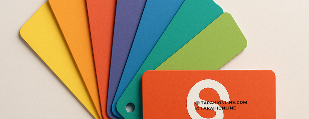
Colors are one of the most critical elements in logo design, as they not only capture attention but also convey emotions, values, and the brand’s personality. Choosing the right color can make a logo memorable and engaging, while a poor choice may confuse or repel customers. This article explores the best colors for logo design that attract customers, delving into color psychology and practical tips for their effective use.
Why Are Colors Important in Logo Design?
Colors have a profound impact on audience perception:
-
Color Psychology: Each color evokes specific emotions and meanings. For example, blue inspires trust, while red conveys excitement.
-
Attention-Grabbing: Bright, contrasting colors stand out in crowded digital or print environments.
-
Brand Identity: Colors help audiences recall a brand (e.g., Coca-Cola’s red or IBM’s blue).
-
Cultural Relevance: Colors carry different meanings across cultures, so they must align with the target audience.
Best Colors for Logo Design
1. Blue: Trust and Professionalism
-
Why It Works: Blue evokes trust, reliability, and professionalism, making it ideal for tech, financial, and service-based brands.
-
Applications: Companies like IBM, Intel, and PayPal use blue to project credibility.
-
Tip: Use darker shades for professionalism and lighter shades for a friendly vibe.
2. Red: Excitement and Energy
-
Why It Works: Red grabs attention and conveys passion, energy, and urgency, perfect for food, entertainment, and retail brands.
-
Applications: Brands like Coca-Cola and Netflix use red to create excitement and quick customer engagement.
-
Tip: Use red sparingly to avoid appearing overly aggressive.
3. Green: Nature and Sustainability
-
Why It Works: Green is associated with nature, health, and sustainability, ideal for environmental, organic, and wellness brands.
-
Applications: Brands like Starbucks and Whole Foods use green to evoke freshness and health.
-
Tip: Darker greens suggest luxury, while lighter greens convey vibrancy.
4. Yellow: Happiness and Creativity
-
Why It Works: Yellow conveys optimism, joy, and creativity, making it suitable for youthful, creative brands.
-
Applications: Brands like McDonald’s and Nikon use yellow to attract attention and evoke fun.
-
Tip: Pair yellow with contrasting colors to maintain readability.
5. Black: Power and Elegance
-
Why It Works: Black conveys luxury, strength, and minimalism, ideal for fashion, tech, and high-end brands.
-
Applications: Brands like Chanel and Nike use black for a sleek, professional look.
-
Tip: Black works well in monochrome or minimal designs but requires high contrast.
6. White: Simplicity and Purity
-
Why It Works: White conveys cleanliness, simplicity, and modernity, often used as a background or in minimal logos.
-
Applications: Brands like Apple use white to project cleanliness and innovation.
-
Tip: Combine white with other colors to avoid it blending into light backgrounds.
7. Color Gradients: Modernity and Dynamism
-
Why It Works: Gradients (smooth color transitions) convey modernity and dynamism, perfect for digital and creative brands.
-
Applications: Instagram uses a colorful gradient to convey vibrancy and diversity.
-
Tip: Use simple gradients with 2–3 colors to avoid clutter.
Key Tips for Choosing Logo Colors
-
Align with Brand Identity: Colors should reflect the brand’s values and personality. For instance, an organic brand may choose green, while a tech brand leans toward blue.
-
Consider the Target Audience: Age, gender, and culture influence color preferences. Bright colors often appeal to younger audiences.
-
Test for Contrast: Ensure the logo is legible on both light and dark backgrounds. Tools like WebAIM can help check contrast.
-
Limit the Color Palette: Use 1–3 colors to avoid a cluttered design.
-
Digital and Print Compatibility: Use RGB for digital and CMYK for print to ensure color accuracy across media.
-
Cultural Sensitivity: Colors have different meanings across cultures. For example, white symbolizes purity in Western cultures but is associated with mourning in some Eastern cultures.
Useful Tools for Choosing Colors
-
Adobe Color: For creating cohesive color palettes.
-
Coolors: For generating attractive color combinations quickly.
-
Canva Color Palette Generator: For drawing inspiration from images.
-
Color Hunt: For discovering trending color palettes.
Successful Examples of Color Use in Logos
-
Coca-Cola (Red): Conveys excitement and joy, making it highly memorable.
-
Starbucks (Green): Evokes freshness and sustainability.
-
Apple (White and Black): Projects simplicity and innovation.
-
Instagram (Gradient): Uses vibrant gradients to convey modernity and diversity.
Choosing the best colors for logo design requires an understanding of color psychology, alignment with brand identity, and consideration of the target audience. Colors like blue, red, green, yellow, black, white, and gradients can attract customers when used thoughtfully and balanced. By leveraging appropriate tools and testing thoroughly across platforms, you can create a logo that is not only visually appealing but also leaves a lasting impression on your audience.
The Tarahi Online graphic and logo design team, with over ten years of experience in professional graphic and logo design, is ready to assist you and bring your ideas to life. Contact us to submit your request or place an order.


