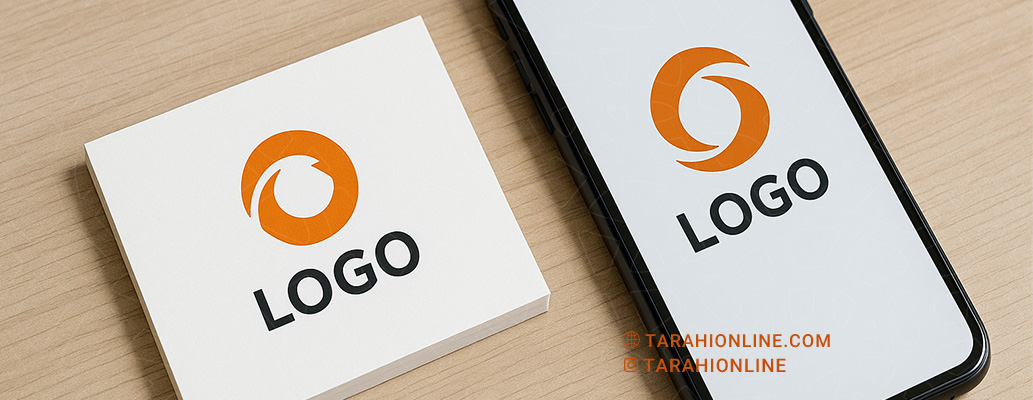
Creating a logo that performs well in both print and digital formats is a key challenge for graphic designers. A logo must remain legible and impactful across various media, from business cards to websites and social media. This article provides a comprehensive guide to designing a logo that excels in both print and digital environments.
Why Is Designing for Print and Digital Important?
As the visual face of a brand, a logo must consistently convey the brand’s identity and message across all platforms. The technical differences between print (high-resolution, CMYK colors) and digital (RGB colors, scalability) require careful consideration. A successful logo should:
-
Look sharp and high-quality in print.
-
Remain clear and appealing on various digital displays (mobile, tablet, desktop).
-
Work effectively in both small and large sizes without losing detail.
Key Tips for Designing a Logo for Print and Digital
To ensure a logo performs well in both environments, follow these principles:
1. Keep the Design Simple and Minimal
-
Why It Matters: Simple logos are more legible in small sizes (e.g., business cards or app icons) and avoid distortion in both print and digital formats.
-
How to Implement:
-
Use a limited number of elements (1–3 colors and shapes).
-
Avoid intricate details like heavy shadows or gradients.
-
Example: Nike’s Swoosh logo is simple and works flawlessly in both print and digital.
-
-
Practical Tip: Test the logo at small sizes (e.g., 16x16 pixels) to ensure it remains readable.
2. Use Vector Formats
-
Why It Matters: Vector files (e.g., SVG or EPS) are scalable and maintain quality in both print and digital without pixelation.
-
How to Implement:
-
Design using software like Adobe Illustrator or Inkscape.
-
Use pixel-based formats like PNG or JPG only for previews.
-
-
Practical Tip: Always save a vector version of the logo for future use in both print and digital applications.
3. Consider Color Systems (CMYK and RGB)
-
Why It Matters: Print uses CMYK (Cyan, Magenta, Yellow, Black), while digital uses RGB (Red, Green, Blue). Color differences between these systems can alter the logo’s appearance.
-
How to Implement:
-
Design in CMYK first for accurate print results, then adjust for RGB in digital.
-
Use colors that convert well between both systems.
-
Utilize tools like Adobe Color to check color compatibility.
-
-
Practical Tip: Test the logo in both CMYK and RGB to ensure color consistency.
4. Choose Readable Fonts
-
Why It Matters: Complex or thin fonts may blur in print or lose legibility in digital formats.
-
How to Implement:
-
Opt for thick, simple sans-serif or serif fonts (e.g., Helvetica or Roboto).
-
Use handwritten or decorative fonts only if readability is guaranteed in small sizes.
-
-
Practical Tip: Ensure a minimum font size of 10pt for print and 12px for digital.
5. Focus on Contrast and Legibility
-
Why It Matters: High contrast ensures the logo stands out on various backgrounds (light or dark) in both print and digital.
-
How to Implement:
-
Use high-contrast colors (e.g., black on white or vice versa).
-
Create a monochrome version for black-and-white printing or engraving.
-
-
Practical Tip: Test the logo on different backgrounds (white, black, colored) to ensure visibility.
6. Design for Scalability
-
Why It Matters: A logo must work in various sizes, from large billboards to small digital icons.
-
How to Implement:
-
Use shapes and lines with appropriate thickness (at least 1mm for print).
-
Avoid overly small details that disappear in smaller scales.
-
-
Practical Tip: Test the logo at different sizes (e.g., 1cm and 10cm) in print and various digital resolutions (e.g., 72dpi and 300dpi).
7. Create Multiple Logo Variants
-
Why It Matters: A logo needs flexibility for different uses (e.g., full-color print, black-and-white, or digital icons).
-
How to Implement:
-
Design horizontal, vertical, and square versions of the logo.
-
Prepare monochrome and inverted versions (for dark backgrounds).
-
-
Practical Tip: Develop a brand guideline that outlines color specifications, sizes, and logo variants.
8. Test in Real-World Environments
-
Why It Matters: A logo that looks good on a screen may appear differently in print.
-
How to Implement:
-
Print the logo on paper, business cards, and other materials.
-
Test it on various digital displays (mobile, laptop, tablet).
-
-
Practical Tip: Use different printers (laser and inkjet) to verify print quality.
Examples of Successful Print and Digital Logos
-
Apple: The simple, neutral-colored apple logo is legible and striking in both print and digital.
-
FedEx: Its use of negative space and limited colors ensures clarity in all formats.
-
Google: A simple sans-serif font with clear colors works across all sizes.
-
Nike: The monochrome, minimalist Swoosh is flawless in both print and digital.
Challenges and Precautions
-
Color Discrepancies: Always verify colors in both CMYK and RGB to avoid inconsistencies.
-
Overly Detailed Designs: Complex logos may fail in small prints or low-resolution digital formats.
-
Insufficient Testing: Without real-world testing, legibility or quality issues may arise.
-
Ignoring Backgrounds: Ensure the logo works on diverse backgrounds (light, dark, textured).
Designing a logo that looks great in both print and digital requires attention to simplicity, scalability, appropriate color systems, and legibility. By using vector formats, selecting suitable colors, and conducting thorough testing across environments, you can create a logo that remains professional and impactful in any medium. Creating multiple logo variants and a brand guideline ensures consistent and effective use. With these principles, your logo will not only be visually appealing but also effectively represent the brand in all contexts.

The Tarahi Online graphic and logo design team, with over ten years of experience in professional graphic and logo design, is ready to assist you and bring your ideas to life. Contact us to submit your request or place an order.