Designing a logo in the agricultural industry requires special attention to the unique aspects of this sector. A successful logo in this field must effectively communicate with the audience and convey the core messages of the brand. In this article, we will explore the key considerations that should be taken into account when designing a logo for the agricultural industry.
1. Simplicity and Recognizability
Simplicity is one of the key principles in logo design. Complex and detailed logos may not be easily recognizable in small sizes or on packaging. A simple and clean logo that easily sticks in the audience’s mind can have a greater impact. Avoid unnecessary details and aim for a design that can convey the brand message at a glance.
Implementation: Instead of using complex and multiple elements, try to use simple symbols and lines. This not only makes your logo more recognizable but also helps it remain memorable to the audience.
2. Choosing Appropriate Colors
Colors play a very important role in conveying messages and creating emotions in the audience. In the agricultural sector, colors like green, brown, and yellow are more commonly used due to their association with nature, earth, and agricultural products. These colors can convey freshness, trust, and naturalness to the audience.
Implementation: Carefully select your color palette and use colors that are in some way related to agricultural products and nature. For example, green can symbolize growth and life, while brown can signify connection with earth and soil.

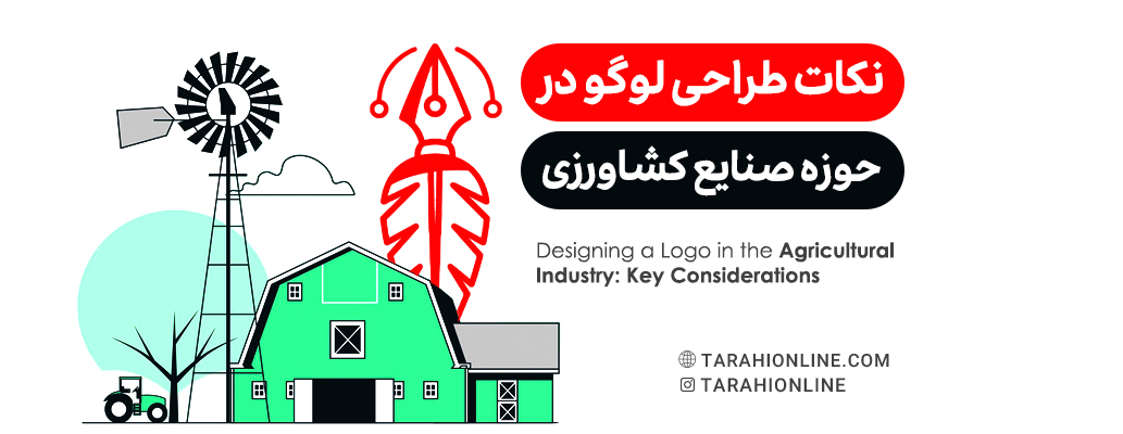
3. Using Relevant Symbols and Images
In logo design for the agricultural sector, using symbols and images related to this field can help in better connecting with the audience. Symbols like leaves, trees, sun, seeds, and agricultural products can effectively represent agricultural activities and have a direct connection with your products.
Implementation: Try to use symbols that are directly related to agriculture and can effectively represent your type of activity. These symbols should be designed in such a way that they are easily recognizable in both small and large sizes.
4. Choosing the Right Font
The fonts used in the logo design should also be chosen in such a way that they are easily readable and align with your brand identity. In the agricultural sector, using simple and natural fonts can help create a sense of naturalness and trust.
Implementation: Avoid overly complex or unreadable fonts. Choose a font that is easily readable in different sizes and conveys a sense of naturalness to the audience.
5. Consistency with Brand Identity
Your logo should be consistent with the overall brand identity. This means having a visual and conceptual connection with other brand elements like brand colors, fonts, and design styles. Ensure that your logo represents the core values and main messages of your brand and effectively conveys the brand identity.
Implementation: Before starting the logo design, make sure you are fully familiar with the brand identity and its values. This includes the colors, fonts, and design styles that your brand uses. Your logo should be designed in such a way that it aligns with other brand elements and effectively represents the brand’s identity and values.
6. Versatility and Flexibility
Your logo should be versatile and flexible enough to perform well in different conditions and sizes. This includes adaptability to various print materials, packaging, websites, and social media. Designing a logo that displays well in all these conditions is very important.
Implementation: Ensure that your logo is easily recognizable in both small and large sizes and displays well in various print and digital materials. Additionally, make sure that your logo is easily recognizable in monochrome (black and white) as well.
7. Distinctiveness and Uniqueness
One of the important features of a successful logo is its distinctiveness and uniqueness. Your logo should be designed in such a way that it stands out from other logos and can be distinguished among competitors. This distinctiveness can be achieved through the use of unique elements, specific colors, or creative combinations of symbols and fonts.
Implementation: Try to use elements that make your logo unique and distinctive. This can include choosing specific colors, using unique symbols, or creative combinations of symbols and fonts. Additionally, make sure that your logo is designed in such a way that it remains memorable and can effectively connect with the audience.
8. Using Feedback and Testing
After the initial design of the logo, it is important to test it in different conditions and gather feedback from various audiences and experts. This feedback can help you identify potential flaws and areas for improvement in your logo design.
Implementation: Test your logo in different conditions such as product packaging, websites, and promotional materials to see how it performs in practice. Gather feedback from the audience and experts and use this feedback to improve your logo design. You can also use A/B testing to compare different versions of the logo and choose the best design.
Designing a logo in the agricultural industry requires precision and attention to detail. By following tips such as simplicity, choosing appropriate colors, using relevant symbols and images, selecting the right font, ensuring consistency with brand identity, maintaining versatility, achieving distinctiveness, and using feedback and testing, you can create a logo that is both attractive and effective. This logo can not only effectively represent the brand and its values but also strengthen connections with customers and enhance brand recognition. With a successful logo, you can make a positive first impression on your audience and encourage them to engage with your agricultural products and services.