Logo design is one of the most critical aspects of visual branding. A simple yet powerful logo can convey a brand’s message clearly and memorably while eliminating unnecessary complexity. This article explores the principles and steps for designing a simple yet impactful logo that resonates with audiences.
Why Simplicity Matters in Logo Design
Simple logos are more effective for the following reasons:
- Easy to Remember: Simple designs are more likely to stick in the audience’s mind.
- Scalability: Simple logos remain clear and legible across various sizes, from business cards to billboards.
- Versatility: Simple designs perform well across different media, from print to digital.
- Quick Message Delivery: A simple logo conveys the brand’s message without distractions.
Steps to Design a Simple and Impactful Logo
- Understand the Brand and Audience
Before designing, deeply understand the brand and its audience by answering:- What are the brand’s core values and message?
- Who is the target audience?
- What emotions (e.g., trust, creativity, or fun) should the logo evoke?
Thorough research ensures the design aligns with the brand’s identity.
- Embrace Minimalist Design
Minimalism is key to a simple logo:- Limit Elements: Use 1–3 core elements (e.g., shapes, text, or icons).
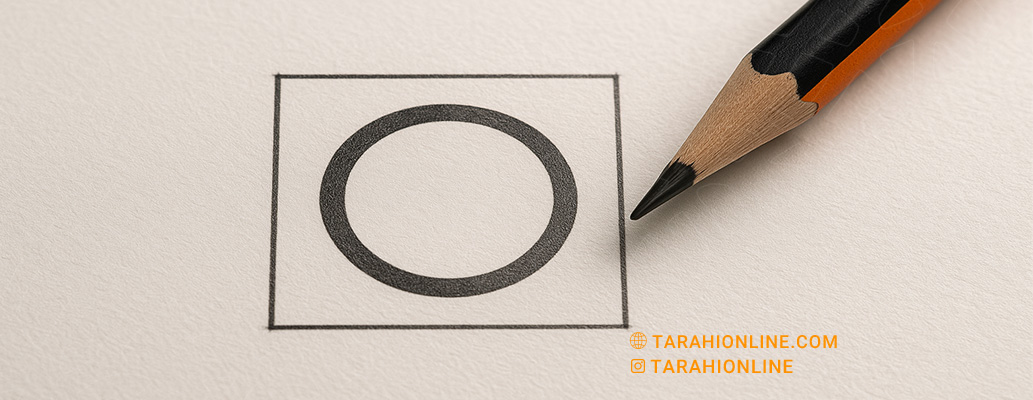
- Clean Lines: Opt for simple geometric shapes like circles, squares, or straight lines.
- Negative Space: Utilize negative space to make the logo stand out.
Example: Nike’s simple swoosh conveys movement and energy through minimalism.
- Choose the Right Colors
Colors play a vital role in evoking emotions and engaging audiences:- Limit Colors: Use 1–3 colors. Monochromatic logos (e.g., Apple) are often highly effective.
- Color Psychology:
- Red: Energy and excitement.
- Blue: Trust and professionalism.
- Green: Nature and sustainability.
- Test in Monochrome: Ensure the logo looks appealing and recognizable in black and white.
- Select an Appropriate Font
If the logo includes text, the font should be simple and legible:- Sans-Serif Fonts: Fonts like Helvetica or Futura offer a modern, clean look.
- Custom Fonts with Care: Ensure custom fonts maintain readability.
- Balance Text and Icon: Ensure text and icons complement each other.
Example: Google’s simple, readable font conveys accessibility.
- Use Simple Geometric Shapes
Geometric shapes like circles, squares, and triangles are effective due to their simplicity and visual balance:- Circle: Unity and friendliness.
- Square: Stability and trust.
- Triangle: Dynamism and direction.
Tip: Avoid overly complex shapes to prevent a cluttered appearance.
- Ensure Scalability
The logo must remain clear and recognizable at all sizes, from app icons to billboards:- Reduce Details: Fine details may get lost at smaller sizes.
- Test Across Sizes: Check the logo at small (e.g., 16x16 pixels) and large scales.
- Create Variations: Design a simpler version for small-scale use.
- Draw Inspiration Without Copying
Study successful logos like Apple, Nike, or FedEx to understand simplicity and impact, but avoid copying. Inspiration helps you grasp effective design principles. - Gather Feedback and Refine
After creating an initial design:- Collect Feedback: Seek opinions from colleagues or clients.
- Test in Context: Evaluate the logo on business cards, websites, and products.
- Make Final Adjustments: Refine based on feedback while maintaining simplicity.
Additional Tips for Greater Impact
- Symmetry and Balance: Symmetrical or balanced logos are visually appealing.
- Storytelling: The logo should convey part of the brand’s story (e.g., FedEx’s arrow suggests speed and movement).
- Media Versatility: Ensure the logo performs well in print, digital, and embossing.
Recommended Design Tools
- Adobe Illustrator: For professional, vector-based designs.
- Canva: Beginner-friendly with ready-made templates.
- Inkscape: A free, open-source option for vector design.
Common Mistakes to Avoid
- Overloading Details: Too many details reduce simplicity and readability.
- Using Too Many Colors: Excessive colors distract and reduce professionalism.
- Inappropriate Fonts: Complex or unreadable fonts harm the logo’s impact.
- Ignoring Scalability: A logo that isn’t clear at small sizes is impractical.
Designing a simple yet impactful logo requires a deep understanding of the brand’s identity, smart use of colors and shapes, and a focus on minimalism. By following the principles outlined in this article, you can create a logo that is not only beautiful and memorable but also performs exceptionally across all media and sizes. For optimal results, always seek feedback and test the logo in various contexts to ensure it effectively conveys the brand’s message.

The Tarahi Online graphic and logo design team, with over ten years of experience in professional graphic and logo design, is ready to assist you and bring your ideas to life. Contact us to submit your request or place an order.