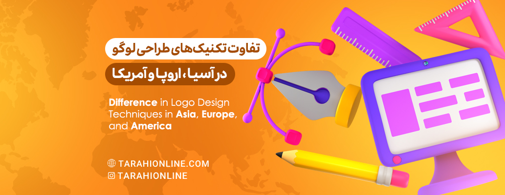
Logo design is one of the most crucial aspects of a brand's visual identity, heavily influenced by regional culture and values. In this article, we will examine in detail the differences in logo design techniques across three major regions of the world - Asia, Europe, and America.
Logo Design in Asia
Key Features:
Use of Traditional and Cultural Symbols: Asian designers often incorporate symbols deeply rooted in the region's culture and history. These can include symbolic animals (like dragons in China), plants (such as cherry blossoms in Japan), or geometric shapes with specific meanings. The use of these symbols adds depth to the logo and creates a stronger emotional connection with the local audience. Example: Japan Airlines (JAL) logo, inspired by a red crane. In Japanese culture, the crane symbolizes longevity and good fortune. This design combines modern simplicity with traditional symbolism.
Symbolic and Meaningful Colors: In Asian cultures, colors often have deep and sometimes complex meanings. For instance, red in China symbolizes luck and happiness, while white in some Asian cultures is associated with mourning. Designers carefully choose colors that are not only visually appealing but also convey appropriate cultural messages. Example: The HSBC logo, consisting of a red and white triangle. The red color in this logo symbolizes prosperity and success in Chinese culture, while the overall design recalls traditional banking flags.
Emphasis on Harmony and Balance: The concept of balance and harmony is crucial in Asian philosophy and art. This is reflected in logo design through the use of symmetrical elements, balanced compositions, and harmonious visual flow. Designers often seek to create a sense of calm and stability in their logos. Example: Singapore Airlines logo, featuring a stylized golden bird. This symmetrical and balanced design conveys a sense of harmony and trust.
Use of Calligraphy and Unique Typography: Calligraphy is a valued art form in many Asian cultures. Logo designers often use traditional calligraphic styles or typography inspired by them. This is particularly common in logos that include writing in Asian languages, adding character and authenticity to the logo. Example: The Lenovo logo, which combines Latin letters with a style inspired by Chinese calligraphy. This design represents the fusion of Eastern and Western cultures.
Logo Design in Europe
Key Features:
Emphasis on Tradition and History: Europe, with its rich and long history, boasts an immense cultural heritage. Logo designers in Europe often draw inspiration from this heritage, incorporating elements rooted in history into their designs. This can include the use of heraldic symbols, classical architectural styles, or references to famous works of art. Example: The Alfa Romeo logo, inspired by the heraldic symbols of Milan. This logo includes the red cross (symbol of Milan) and the large serpent (symbol of the Visconti family).
Use of Classic Typography: Typography plays a crucial role in European logo design. Designers often use classic and traditional fonts that have roots in European printing and typeface design history. Creating custom fonts that combine classic and modern elements is also very common. Example: The Louis Vuitton logo, which uses classic and refined typography. This design conveys a sense of history and authenticity to the audience.
Minimalist Design: The tendency towards simplicity and minimalism is strong in European design. This approach has its roots in 20th-century art and design movements such as Bauhaus. European designers often seek to create logos that have maximum impact with minimum elements. Example: The Adidas logo, consisting of three simple lines. This minimalist design is easily recognizable and memorable.
Attention to Subtle Details: European designers often pay special attention to subtle details. This can include the use of precise proportions, clever negative spaces, or subtle visual elements that are not immediately noticeable but add depth and complexity to the design. Example: The BMW logo, which at first glance seems simple, but contains subtle details. The blue and white colors represent Bavaria, and the overall design recalls an airplane propeller, referring to the company's roots in the aviation industry.
Logo Design in America
Key Features:
Bold and Energetic: Logo design in America often reflects the dynamic and energetic spirit of American culture. Logos are usually designed with strong lines, bold shapes, and dynamic compositions to convey a sense of movement and progress. This characteristic aligns with the entrepreneurial and innovative spirit prevalent in American business culture. Example: The Nike logo, consisting of a simple but dynamic "swoosh". This design conveys a sense of movement and speed, perfectly aligning with the company's "Just Do It" slogan.
Use of Bright and Diverse Colors: American designers often use a wide range of bold and cheerful colors. These colors are used to grab immediate attention and create distinction in a competitive market. Bold and unusual color combinations are also common and are used as a way to demonstrate innovation and creative thinking. Example: The Google logo, which uses four primary colors (blue, red, yellow, and green). This bold color combination represents diversity and creativity.
Emphasis on Innovation and Progress: American culture places high value on innovation and progress, and this is reflected in logo design. Designers often seek new and creative ways to represent concepts. The use of advanced design techniques, unusual combinations, and innovative concepts is common in American logos. Example: The Apple logo, consisting of a bitten apple. This simple but innovative design symbolizes knowledge (Newton's apple) and technological innovation (biting the apple).
Simplification for Use in Various Media: Given the importance of digital marketing and strong presence on social media, American designers often create logos that work well in different sizes and formats. This includes designing simplified versions of logos for use in app icons, social media profile pictures, and other digital applications. Example: The Twitter logo, consisting of a simple blue bird. This design works well in various sizes, from app icons to billboards.
Cultural Differences and Reasons
Asia vs. Europe and America: Design in Asia focuses more on symbolic meanings and harmony, while Western design emphasizes visual impact and functionality. Explanation: This difference is rooted in the different philosophies of East and West. Asian cultures often emphasize harmony with nature, respect for traditions, and deep symbolic meanings. In contrast, Western culture focuses more on pragmatism, innovation, and immediate impact. This philosophical difference is reflected in logo design, where Asian logos often have hidden layers of meaning, while Western logos focus more on creating immediate impact and memorability.
Europe vs. America: European design tends to preserve classic and historical elements, while American design leans more towards innovation and breaking traditional rules. Explanation: This difference can be attributed to the different histories of these two regions. Europe, with its long and rich history, places high value on traditions and cultural heritage. This is reflected in logo design through the use of classic elements and historical references. In contrast, America, as a relatively young country, focuses more on the future and innovation. This attitude is reflected in bold and innovative logo designs that often challenge traditional rules.
Color: In Asia, colors have deep cultural meanings, while in the West, colors are used more for attention-grabbing and differentiation. Explanation: In Asian cultures, colors are often associated with deep philosophical, religious, or cultural concepts. For example, in China, red symbolizes luck and happiness, while white can be associated with mourning. These deep meanings influence color choices for logos. In Western culture, although colors also have symbolic meanings, color choice in logo design is more based on visual impact, attention-grabbing, and market differentiation.
Typography: In Asia, calligraphy and written characters are highly important, while in the West, modern typography and readability take priority. Explanation: In many Asian cultures, calligraphy is a valued art form with a long history. Writing systems like Japanese Kanji or Chinese characters act as strong visual elements themselves. As a result, Asian logo designs often use calligraphy styles or written characters as main design elements. In contrast, Western culture focuses more on readability and quick information transfer. Western designers often use modern and simple fonts that read well in various sizes and on different backgrounds.
Symbolism: In Asia, the use of traditional symbols is common, while in the West, symbols are often more abstract and modern. Explanation: Asian cultures are rich in traditional symbols and images with deep and complex meanings. Using these symbols in logo design creates a strong connection with cultural heritage and is meaningful to local audiences. For example, the use of dragons in Chinese logos or cherry blossoms in Japanese designs is common. In contrast, Western designers tend to use more abstract and modern symbols. These symbols are often designed to convey universal concepts or brand values and are less tied to specific cultural traditions.
The differences in logo design techniques across Asia, Europe, and America reflect the rich cultural, historical, and philosophical diversity of these regions. Understanding these differences is crucial not only for logo designers but for all professionals working in global marketing and branding. In the age of globalization, the main challenge for designers is to create logos that maintain a specific cultural identity while also being able to connect with global audiences.