Logo design is one of the most critical aspects of a brand’s visual identity, serving as a visual emblem that communicates an organization’s values, mission, and personality to its audience. A well-designed logo must be simple, recognizable, and memorable to leave a lasting impression. In this context, the use of grids and geometry plays a pivotal role in creating logos that are not only visually appealing but also structurally coherent and professional. These tools enable designers to craft designs that are balanced, scalable, and impactful. This article comprehensively explores the concept of grids and geometry in logo design, their significance, practical applications, and their psychological impact on audiences.
What is a Grid and Why is it Important in Logo Design?
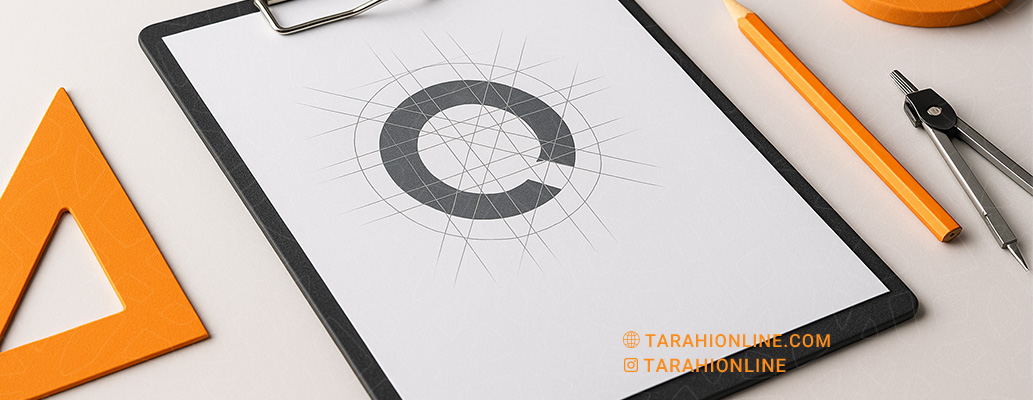
A grid is a system of horizontal and vertical lines that serves as a framework for organizing visual elements in design. Acting as a roadmap, it helps designers arrange components such as shapes, text, and symbols with precision and order. Grids are particularly crucial in logo design because logos must perform effectively across various sizes and media, from business cards to billboards, while consistently conveying the brand’s identity.
Benefits of Using Grids in Logo Design
Grids provide a structured foundation that offers several advantages:
-
Balance and Proportion: Grids ensure visual balance, preventing clutter or disorganization in the design.
-
Scalability and Flexibility: They allow logos to be resized without losing proportions, ensuring clarity in both small (e.g., website favicons) and large (e.g., billboards) formats.
-
Consistency with Brand Identity: Grids help align the logo with other elements of a brand’s visual identity, such as colors and typography.
-
Precision and Professionalism: Grids enable precise adjustments to details like spacing and alignment, enhancing the logo’s polished appearance.
-
Reproducibility: Grids facilitate consistency in collaborative projects or future redesigns, ensuring adherence to the original design principles.
Types of Grids in Logo Design
Grids come in various forms, each suited to specific design needs:
-
Square Grid: Ideal for logos requiring symmetry and stability.
-
Circular Grid: Used for logos based on circular or curved shapes, such as the Apple logo.
-
Modular Grid: Suitable for complex designs that combine multiple elements.
-
Golden Ratio Grid: Based on the golden ratio (1:1.618), this grid is popular for its naturally harmonious proportions, seen in logos like Apple and Pepsi.
The Role of Geometry in Logo Design
Geometry, the study of shapes, sizes, and spatial relationships, is a cornerstone of logo design. Geometric shapes like circles, squares, triangles, and lines are powerful tools due to their simplicity, clarity, and ability to convey deep symbolic meanings. These shapes not only form the visual structure of a logo but also communicate the brand’s message and values.
Meanings of Geometric Shapes in Logo Design
Each geometric shape carries specific meanings and evokes particular emotions:
-
Circle: Symbolizes unity, perfection, friendship, and community. Its soft, edgeless form conveys calmness and approachability. Brands like BMW, Starbucks, and Target use circles to evoke unity and accessibility.
-
Square: Represents stability, strength, trust, and order. Its equal angles and solid structure suggest reliability and professionalism. Companies like Microsoft, Adobe, and American Express use squares to convey dependability.
-
Triangle: Symbolizes dynamism, movement, direction, and sometimes power. Its sharp angles can evoke excitement or caution. Logos like Adidas and Citibank use triangles to convey energy and progress.
-
Lines: Straight lines denote precision, professionalism, and structure, while curved lines suggest softness, creativity, and fluidity. Nike’s Swoosh logo uses curved lines to evoke movement and speed.
-
Hexagons and Polygons: These shapes, often associated with technology or science, convey innovation and precision due to their complexity.
Geometry and Visual Psychology
Geometric shapes have a profound impact on audience perception and emotions. Visual psychology suggests that the human brain instinctively responds to shapes:
-
Circles, resembling natural objects like the sun or moon, evoke familiarity and comfort.
-
Squares, with their orderly structure, convey stability and trustworthiness.
-
Triangles, with their sharp angles, draw attention and suggest dynamism or caution. Designers leverage these psychological effects to reinforce a brand’s message and create an emotional connection with the audience.
Application of Grids and Geometry in the Logo Design Process
Grids and geometry work as complementary tools throughout the logo design process. Here’s how they are applied:
Creating a Base Grid
Designers typically begin by establishing a base grid, which may consist of square, circular, or modular patterns. This grid serves as a framework for positioning logo elements, such as icons, text, or shapes, ensuring proportional alignment. For instance, Twitter’s logo uses a circular grid to create its iconic bird, achieving a simple and balanced appearance.
Using Geometric Shapes
After setting up the grid, designers employ geometric shapes to construct the logo’s core forms. A common technique is using the golden ratio, which creates naturally appealing proportions, as seen in the logos of Apple and Pepsi. Combining shapes, such as circles and lines, can also result in unique and intricate designs.
Repetition and Symmetry
Geometry enables the use of repetition and symmetry to create visually engaging logos. Symmetrical designs convey balance and professionalism, while asymmetrical ones evoke dynamism and creativity. For example, the FedEx logo uses subtle asymmetry in its typography to create a hidden arrow, symbolizing speed and direction.
Simplification Through Geometry
Simplicity is a key principle in logo design. Geometry helps designers create minimal yet impactful logos using basic shapes. The Olympic logo, with its five interlocking circles, uses simple geometry to convey a universal message of unity and collaboration.
Successful Examples of Grid and Geometry in Logo Design
Many iconic logos have been crafted using grids and geometry. Here are some notable examples:
-
Apple Logo: Designed using the golden ratio and concentric circles, this logo conveys simplicity, perfection, and innovation.
-
Nike Logo: The Swoosh, built on a dynamic grid with curved lines, evokes movement, speed, and energy.
-
Mercedes-Benz Logo: The three-pointed star, designed with triangles and radial symmetry, symbolizes quality, excellence, and precision engineering.
-
Audi Logo: Four interlocking circles, based on a circular grid, represent the unity of the four companies that formed Audi.
-
IBM Logo: Designed with horizontal lines and a modular grid, this logo conveys order, technology, and professionalism.
Challenges and Limitations of Using Grids and Geometry
Despite their benefits, grids and geometry present certain challenges:
-
Creativity Constraints: Over-reliance on grids can make logos appear overly mechanical, potentially stifling creativity.
-
Excessive Complexity: Complex geometric shapes may reduce legibility in smaller sizes, such as app icons.
-
Need for Expertise: Effective use of grids and geometry requires deep knowledge of graphic design principles and visual composition.
-
Balancing Simplicity and Complexity: Striking the right balance between simplicity (for legibility) and complexity (for visual interest) can be challenging.
Impact of Grids and Geometry on Brand Identity
Grids and geometry not only enhance the visual quality of logos but also shape a brand’s identity. A well-designed logo should reflect the brand’s values and personality. For example:
-
Luxury brands like Chanel and Louis Vuitton use symmetrical grids and simple geometric shapes to convey elegance and quality.
-
Tech brands like Google and Apple rely on minimal geometry to project innovation and simplicity.
-
Sports brands like Nike and Puma use dynamic lines and shapes to evoke energy and movement.
Modern Tools for Using Grids and Geometry
Modern design software, such as Adobe Illustrator, Figma, and CorelDRAW, offers advanced tools for creating grids and working with geometric shapes. These platforms allow designers to build custom grids, implement the golden ratio, and precisely adjust shapes. Additionally, emerging technologies like parametric design enable the creation of logos with more complex geometric patterns using algorithms.
Grids and geometry are foundational tools in logo design, enabling the creation of coherent, balanced, and meaningful designs. Grids provide a structural framework for organizing elements, while geometry uses simple, symbolic shapes to convey a brand’s message. By thoughtfully applying these tools, designers can craft logos that are not only visually stunning and professional but also memorable and reflective of the brand’s identity. Ultimately, grids and geometry serve as a bridge between creativity and structure, empowering brands to stand out in today’s competitive landscape.

The Tarahi Online graphic and logo design team, with over ten years of experience in professional graphic and logo design, is ready to assist you and bring your ideas to life. Contact us to submit your request or place an order.