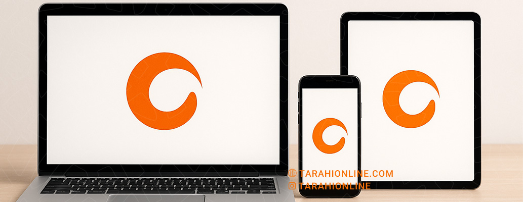
In today’s world, where brands connect with audiences across diverse platforms—from print to digital—designing a logo that performs consistently across various media is crucial. As the cornerstone of a brand’s visual identity, a logo must remain clear, effective, and cohesive whether displayed on a small business card, a massive billboard, or a digital screen. But how can you design a logo that achieves this level of versatility? This article explores the key principles and strategies for creating a logo that excels across different media.
1. Embrace Simplicity
One of the most critical factors in designing a logo that adapts well to various media is simplicity. Simple logos, with clean lines, geometric shapes, and minimal details, maintain clarity across all sizes and formats. Complex logos with intricate elements may lose legibility when scaled down or reproduced in monochrome.
For example, Apple’s bitten apple logo works seamlessly on both tiny smartphone screens and large advertising displays. To achieve this simplicity, designers should eliminate unnecessary elements and focus on conveying the brand’s core message.
2. Use a Limited Color Palette
Choosing an appropriate color palette is vital for a logo’s versatility. Logos with a limited number of colors—typically one or two primary hues—perform better in both print and digital formats. Too many colors can create challenges in monochrome printing or under varying lighting conditions.
Additionally, a logo should remain recognizable in black-and-white or grayscale. For instance, Nike’s swoosh retains its identity even in a single color. To ensure compatibility, designers should test the logo in full color, monochrome, and grayscale.
3. Design for Scalability
A logo must function effectively across a range of sizes, from small app icons to large billboards. This quality, known as scalability, requires balanced proportions and clear elements. A logo that loses readability at smaller sizes will struggle in contexts like social media avatars or website favicons.
To ensure scalability, designers should test the logo at various sizes and avoid overly detailed elements or intricate fonts. The FedEx logo, with its simple design and legible typography, is a prime example of scalability.

4. Choose the Right Font
If a logo includes text, selecting an appropriate font is essential for cross-media compatibility. Sans-serif fonts, known for their simplicity and readability, are often the best choice for logos. Ornate or decorative fonts may become illegible at smaller sizes or in low-quality printing.
For example, Google’s logo uses a clean, modern font that performs well across digital displays and print materials. Designers should choose a font that is both legible and reflective of the brand’s personality.
5. Focus on Geometric Proportions
Geometric proportions in logo design help maintain visual balance. A logo built with balanced ratios and simple shapes performs better across media. For instance, Twitter’s simplified bird logo uses geometric forms that remain clear at any scale or in any format.
Designers can use design grids to ensure balance and proportion, creating a logo that looks cohesive in all visual contexts.
6. Test Across Different Backgrounds
A versatile logo must perform well on various backgrounds, whether light, dark, or busy. Some logos look great on a white background but get lost on darker or textured surfaces. To address this, designers should create multiple versions of the logo, such as light, dark, or transparent variants.
For example, Amazon’s logo, with its simple arrow and black text, remains legible on any background. Testing the logo in real-world scenarios, such as on websites, apps, or packaging, helps identify potential issues.
7. Optimize for Digital Formats
With the growing importance of digital media, a logo must be optimized for various screen displays. This includes using high-resolution formats (like vector or high-quality PNG) and ensuring compatibility with digital aspect ratios, such as square or rectangular formats for social media icons.
Designers should create logos in vector formats (e.g., SVG or EPS) to allow resizing without quality loss, making them ideal for web and app use.
8. Avoid Trend-Driven Designs
Logos that rely heavily on fleeting trends may struggle in certain media or become outdated quickly. For example, 3D effects or complex gradients can be problematic in print or low-resolution displays. Simple, classic designs tend to perform better across all media.
Practical Tips for Designing a Versatile Logo
To create a logo that performs well across media, consider these tips:
-
Use Vector Formats: These allow resizing without quality loss.
-
Limit Colors: A simple color palette ensures compatibility in print and digital.
-
Select Readable Fonts: Sans-serif fonts are ideal for legibility across media.
-
Test in Real Contexts: Evaluate the logo on business cards, websites, and billboards.
-
Prepare Multiple Variants: Create monochrome, transparent, and reversed versions for flexibility.
Designing a logo that is versatile across media requires attention to simplicity, scalability, color and font choices, and real-world testing. A well-designed, adaptable logo not only conveys a brand’s identity effectively across platforms but also reinforces visual consistency and brand recognition. By following the principles outlined in this article, designers can create a logo that remains powerful, flexible, and timeless in today’s diverse media landscape.

The Tarahi Online graphic and logo design team, with over ten years of experience in professional graphic and logo design, is ready to assist you and bring your ideas to life. Contact us to submit your request or place an order.