A logo serves as the visual heart of a brand, often acting as the first point of contact with its audience. The colors used in a logo can evoke specific emotions, reinforce the brand’s message, and even influence audience behavior. Color psychology is the study of how colors affect human emotions, perceptions, and decision-making. In this article, we explore the psychological effects of key colors in logo design, their applications, and essential tips for selecting the right colors.
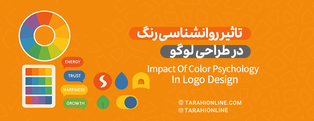
Why is Color Psychology Important in Logo Design?
Colors are a powerful visual language that communicate messages and emotions without words. In logo design, colors can:
-
Evoke Emotions: Warm colors like red create excitement, while cool colors like blue promote calmness.
-
Define Brand Identity: Specific colors align with brand values, such as trust, creativity, or luxury.
-
Capture Attention: Bright and contrasting colors can make a logo stand out among competitors.
-
Create Memorability: Memorable colors help a logo stay etched in the audience’s mind.
Choosing the wrong color can weaken a brand’s message or even mislead the audience. Thus, understanding color psychology is crucial for designing an effective logo.
Psychology of Key Colors in Logo Design
Each color carries unique psychological effects. Below, we explore the primary colors and their applications in logo design:
1. Red
-
Psychological Impact: Red symbolizes excitement, energy, passion, and strength. It grabs attention and creates a sense of urgency.
-
Use in Logos: Ideal for brands aiming to appear bold, energetic, and forward-thinking, such as those in food, sports, or entertainment industries.
-
Examples: Coca-Cola, Netflix.
-
Tip: Overuse of red may evoke aggression, so use it sparingly and with balance.
2. Blue
-
Psychological Impact: Blue represents trust, professionalism, calmness, and stability. It conveys security and reliability.
-
Use in Logos: Perfect for technology, finance, and healthcare brands aiming to build audience trust.
-
Examples: IBM, Facebook, Samsung.
-
Tip: Different shades of blue (e.g., navy or turquoise) can convey varying tones of professionalism or vibrancy.
3. Yellow
-
Psychological Impact: Yellow signifies optimism, happiness, creativity, and energy. It attracts attention and radiates warmth.
-
Use in Logos: Suitable for creative, youth-oriented, or children’s brands.
-
Examples: McDonald’s, Nike (in some designs).
-
Tip: Bright yellow can strain the eyes, so pair it with neutral colors for balance.
4. Green
-
Psychological Impact: Green symbolizes nature, growth, health, and sustainability. It conveys freshness and tranquility.
-
Use in Logos: Ideal for environmental, organic food, and healthcare brands.
-
Examples: Starbucks, John Deere.
-
Tip: Darker greens evoke luxury, while lighter greens feel fresh and vibrant.
5. Black
-
Psychological Impact: Black represents power, elegance, modernity, and luxury. It enhances a sense of professionalism.
-
Use in Logos: Suitable for luxury, fashion, and high-tech brands.
-
Examples: Chanel, Nike, Adidas.
-
Tip: Pair black with other colors to avoid a heavy or somber feel.
6. White
-
Psychological Impact: White symbolizes simplicity, purity, and cleanliness. It conveys minimalism and clarity.
-
Use in Logos: Often used as a background color or alongside other colors for modern, clean designs.
-
Examples: Apple (in some designs), Adidas.
-
Tip: White is versatile but may be limited to backgrounds in digital designs, though it shines in print.
7. Orange
-
Psychological Impact: Orange combines the energy of red and the cheerfulness of yellow. It conveys creativity, adventure, and friendliness.
-
Use in Logos: Great for youthful, creative, and fun brands.
-
Examples: Amazon, Fanta.
-
Tip: Softer orange tones create a more approachable feel.
8. Purple
-
Psychological Impact: Purple symbolizes creativity, luxury, and spirituality. It conveys a sense of mystery and sophistication.
-
Use in Logos: Ideal for creative, beauty, and luxury brands.
-
Examples: Yahoo, Cadbury.
-
Tip: Darker purples evoke luxury, while lighter purples feel more creative.
9. Gray
-
Psychological Impact: Gray represents neutrality, professionalism, and balance. It conveys modernity and simplicity.
-
Use in Logos: Suitable for technology, finance, and minimalist brands.
-
Examples: Mercedes-Benz, Apple (in some designs).
-
Tip: Combine gray with other colors to avoid a dull appearance.
10. Pink
-
Psychological Impact: Pink symbolizes femininity, playfulness, and love. It conveys warmth and youthfulness.
-
Use in Logos: Ideal for beauty, fashion, and women-oriented products.
-
Examples: Barbie, T-Mobile.
-
Tip: Light pink appeals to younger audiences but may not suit formal brands.
Key Tips for Choosing Logo Colors
To select the right color for a logo, consider these factors:
-
Target Audience: Colors should align with the age, gender, and cultural preferences of the audience. For example, pink may appeal more to younger or female audiences.
-
Industry Alignment: Colors should match the industry. Green suits eco-friendly brands, while blue is ideal for tech.
-
Versatility: Ensure the logo looks good across various media (digital, print, black-and-white). Limit the palette to 2-3 colors.
-
Cultural Context: Colors have different meanings across cultures. For instance, white symbolizes purity in Western cultures but is associated with mourning in some Eastern cultures.
-
Color Harmony: Use the color wheel to create harmonious combinations, such as complementary or analogous colors.
Challenges of Using Color in Logo Design
-
Over-Saturation: Overly bright or excessive colors can distract the audience.
-
Cultural Misalignment: Colors appealing in one culture may be inappropriate in another.
-
Media Consistency: Some colors may appear differently in print versus digital formats.
How to Leverage Color Psychology for Your Brand
-
Analyze Your Brand: Define your brand’s values, mission, and personality. For example, creative brands may benefit from purple or orange.
-
A/B Testing: Test different color variations of your logo to see which resonates most with your audience.
-
Use Color Shades: Different shades of a color can evoke varying emotions or tones.
-
Consult a Professional Designer: A graphic designer with knowledge of color psychology can create a logo tailored to your brand.
Color psychology in logo design is a powerful tool for building emotional connections with audiences and strengthening brand identity. Each color conveys a unique me.

The Tarahi Online graphic and logo design team, with over ten years of experience in professional graphic and logo design, is ready to assist you and bring your ideas to life. Contact us to submit your request or place an order.