Logo design is one of the most critical aspects of a brand’s visual identity, and selecting the right color plays a key role in attracting audiences and conveying the brand’s message. Colors not only evoke emotions and feelings but also visually communicate a brand’s identity, values, and personality. This article explores the most appealing colors in logo design, the psychology behind them, and practical tips for choosing appropriate colors.
Color Psychology in Logo Design
Color psychology is the study of how colors influence human behavior, emotions, and decision-making. Each color conveys specific meanings and emotions, and in logo design, these meanings should align with the brand’s objectives and message. Below are commonly used colors and their effects:
1. Red: Energy and Passion
-
Meanings: Love, energy, power, passion, danger
-
Use Cases: Red is a bold color that grabs attention. Brands like Coca-Cola and Netflix use it to evoke excitement and dynamism.
-
Advantages: Instantly noticeable, creates a sense of urgency
-
Disadvantages: Overuse may come across as aggressive
2. Blue: Trust and Professionalism
-
Meanings: Calm, trust, stability, professionalism
-
Use Cases: Blue is one of the most popular logo colors. Brands such as IBM, Facebook, and Samsung use it to instill trust and reliability.
-
Advantages: Suitable for technology, finance, and healthcare brands
-
Disadvantages: Excessive use may create a cold or monotonous feel
3. Yellow: Joy and Optimism
-
Meanings: Happiness, energy, creativity, warmth
-
Use Cases: A warm and inviting color, yellow appears in logos like McDonald’s and Nikon. It's effective in drawing attention and generating positive feelings.
-
Advantages: Evokes optimism and visibility
-
Disadvantages: Can cause anxiety if misused
4. Green: Nature and Growth
-
Meanings: Nature, health, growth, sustainability
-
Use Cases: Ideal for eco-friendly, health, and agriculture brands like Starbucks and John Deere.
-
Advantages: Conveys calm and balance
-
Disadvantages: May appear too neutral or unexciting in certain contexts
5. Black: Luxury and Power
-
Meanings: Power, elegance, luxury, mystery
-
Use Cases: Used by premium brands like Chanel and Nike to express sophistication and authority.
-
Advantages: Minimalistic and professional look
-
Disadvantages: Can feel heavy or somber in some contexts
6. White: Simplicity and Purity
-
Meanings: Purity, simplicity, clarity
-
Use Cases: Often used as a background or in minimal logos like Apple’s.
-
Advantages: Clean and modern aesthetic
-
Disadvantages: May lack visual appeal on its own
7. Orange: Creativity and Friendliness
-
Meanings: Creativity, friendliness, energy, adventure
-
Use Cases: A vibrant color found in logos like Amazon and Fanta.
-
Advantages: Warm and approachable
-
Disadvantages: May appear unprofessional in some industries
8. Purple: Creativity and Luxury
-
Meanings: Creativity, luxury, spirituality, mystery
-
Use Cases: Suitable for creative and premium brands like Yahoo and Cadbury.
-
Advantages: Feels unique and distinctive
-
Disadvantages: May be less appealing to general audiences
Color Combinations in Logo Design
While a single color may suffice for some logos, many brands use color combinations for greater impact. Consider the following tips when combining colors:
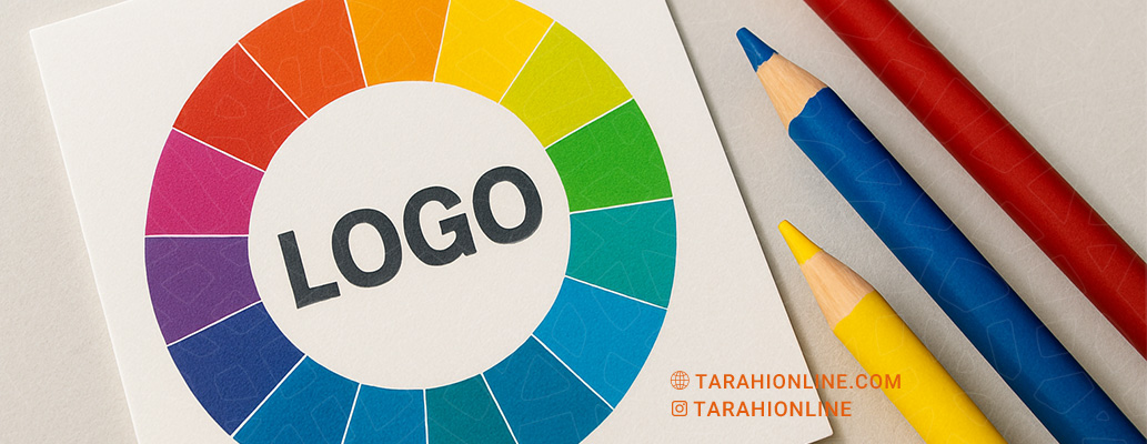
Using the Color Wheel
-
Complementary Colors: Opposite on the color wheel (e.g., red and green), offer high contrast.
-
Analogous Colors: Adjacent on the color wheel (e.g., blue and green), provide harmony.
-
Triadic Colors: Equally spaced on the color wheel (e.g., red, yellow, blue), create balanced visuals.
Balancing Colors
-
Use one primary and one or two secondary colors to avoid clutter.
-
Neutral colors (white, gray, black) help maintain balance and focus.
Considering Industry Context
-
Technology brands often use blue and gray.
-
Food brands commonly use red and yellow to stimulate appetite and attention.
Practical Tips for Choosing Logo Colors
Understand Your Target Audience
Colors must align with the audience’s preferences and expectations.
-
Children prefer bright, cheerful colors (e.g., yellow, orange).
-
Adults may favor neutral, professional tones.
Align with Brand Identity
Colors should reflect the brand’s values and personality.
-
A sustainable brand might choose green.
-
A luxury brand may opt for black or purple.
Account for Culture and Geography
Color meanings vary across cultures.
-
White signifies purity in Western cultures, but may represent mourning in some Eastern traditions.
Maintain Simplicity and Legibility
The logo must remain legible in different sizes and backgrounds.
-
Use combinations with sufficient contrast.
Test and Gather Feedback
Test the logo in various environments (print, digital, monochrome) and collect audience feedback before finalizing.
Emerging Trends in Logo Color Selection
Recent years have seen the following trends:
-
Gradients: Multi-tone transitions (e.g., Instagram) add depth and interest
-
Neon Colors: Bright, energetic tones for youthful brands
-
Pastel Shades: Soft tones for calm, modern appeal
-
Minimalism: Neutral or monochrome palettes for a clean, elegant appearance
Choosing colors in logo design extends beyond personal preference; it requires deep understanding of color psychology, brand identity, and audience expectations. Colors like blue, red, and green remain popular due to their emotional impact and versatility. However, the success of a logo ultimately depends on how well the colors align with the brand’s message and visual appeal. By following the outlined principles and observing current trends, you can create a logo that is both attractive and memorable.

The Tarahi Online graphic and logo design team, with over ten years of experience in professional graphic and logo design, is ready to assist you and bring your ideas to life. Contact us to submit your request or place an order.