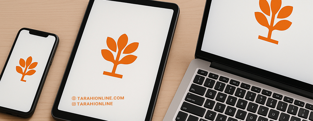
A logo, as a core element of a brand’s visual identity, must maintain its clarity, readability, and appeal across all platforms and sizes, from tiny app icons to large billboards. Designing a logo that performs well on every device and size requires attention to technical details, design principles, and adaptability to both digital and print needs. In this article, we’ll explore key techniques and tips for creating such a logo.
Why is Logo Compatibility Across Devices and Sizes Important?
With the widespread use of digital devices like smartphones, tablets, websites, and print media, a logo must look consistent and professional in every context. The importance of this lies in:
-
Unified User Experience: The logo should appear cohesive across all touchpoints, from social media to packaging.
-
Professional Brand Image: A logo that blurs or becomes illegible in small sizes can make the brand appear unprofessional.
-
Versatility in Application: The logo must be suitable for diverse media, from digital screens to printed materials.
Techniques for Designing a Logo for All Devices and Sizes
1. Design in Vector Formats
Vector-based logos (e.g., SVG or EPS formats) maintain quality at any size, unlike pixel-based images (e.g., PNG or JPEG) that become blurry when scaled.
Technique: Use software like Adobe Illustrator or Inkscape to design the logo and save the final file in SVG format.
2. Simplify the Design
Simple logos perform better at small sizes and retain clarity:
-
Eliminate Unnecessary Details: Avoid thin lines, shadows, or intricate patterns that may disappear in small sizes.
-
Use Geometric Shapes: Simple shapes like circles, squares, or clean lines remain legible at any scale.
-
Limited Color Palette: Use 1–3 colors to ensure clarity in both print and digital formats.
Technique: Test the logo at small sizes (e.g., 16x16 pixels for favicons) to ensure it remains recognizable.
3. Choose Readable Typography
Typography must remain legible across various sizes:
-
Sans-Serif Fonts: These perform well at small sizes and have a modern look.
-
Appropriate Size and Weight: Avoid overly thin or decorative fonts that lose clarity.
-
Proper Spacing: Adjust letter spacing (kerning) to prevent crowding in small sizes.
Technique: Test the font at various sizes (from 10px to 100px) and use standard fonts like Roboto or Helvetica for reliability.
4. Focus on Contrast and Color
Colors must remain clear across different backgrounds and devices:
-
High Contrast: Ensure the logo is legible on both light and dark backgrounds.
-
Digital and Print Colors: Use CMYK for print and RGB for digital formats.
-
Monochrome Version: Create a single-color version for scenarios with limited color options (e.g., engraving or single-color printing).
Technique: Test the logo in monochrome and on various backgrounds. Tools like Adobe Color can help select appropriate colors.
5. Create Multiple Logo Versions
The logo should have variations for different formats and uses:
-
Primary Version: For websites and posters.
-
Simplified Version: For app icons or favicons.
-
Monochrome or Line Version: For specific printing needs or busy backgrounds.
Technique: Develop a style guide that includes all logo variations and usage guidelines.
6. Utilize Negative Space
Negative space helps maintain clarity at small sizes while adding a creative touch to the design.
Technique: Draw inspiration from successful logos like FedEx (with its hidden arrow) and incorporate negative space cleverly in your design.
7. Test Across Different Environments
The logo must be tested on various platforms, from high-resolution retina displays to high-quality prints:
-
Digital: Test on websites, apps, Instagram, and favicons.
-
Print: Check on business cards, billboards, and packaging.
-
Small and Large Sizes: Ensure clarity from 16x16 pixels to several meters.
Technique: Use tools like Figma or Adobe XD to simulate the logo’s appearance in different contexts.
8. Consider Aspect Ratios
The logo’s proportions should be balanced to avoid distortion across formats:
-
Standard Ratios: Square or near-square logos work well for icons.
-
Flexibility: Ensure the logo functions in both horizontal and vertical formats without losing proportions.
Technique: Test the logo in various formats (square, rectangle, circle) and use design grids to maintain balance.
9. Draw Inspiration from Successful Logos
Analyzing logos from major brands can provide valuable insights:
-
Nike Logo: Simple, monochrome, and clear at any size.
-
Apple Logo: Minimal and balanced for all platforms.
-
Google Logo: Legible at small sizes and optimized for digital use.
Technique: Study successful logos to understand their design principles, but avoid copying and focus on applying those principles to your work.
10. Gather Feedback
After designing, collect feedback from customers, designers, or the target audience:
-
Audience Testing: Survey whether the logo looks appealing and clear across sizes and devices.
-
Professional Input: Feedback from designers can help identify technical issues.
Technique: Use platforms like SurveyMonkey or focus groups to gather constructive feedback.
Designing a logo that looks good on all devices and sizes requires attention to simplicity, vector formats, readable typography, appropriate colors, and thorough testing. By applying these techniques, you can create a logo that is not only professional and visually appealing but also performs flawlessly across every context, from tiny icons to large billboards. A versatile logo is a valuable asset for strengthening brand identity and building audience trust.

The Tarahi Online graphic and logo design team, with over ten years of experience in professional graphic and logo design, is ready to assist you and bring your ideas to life. Contact us to submit your request or place an order.