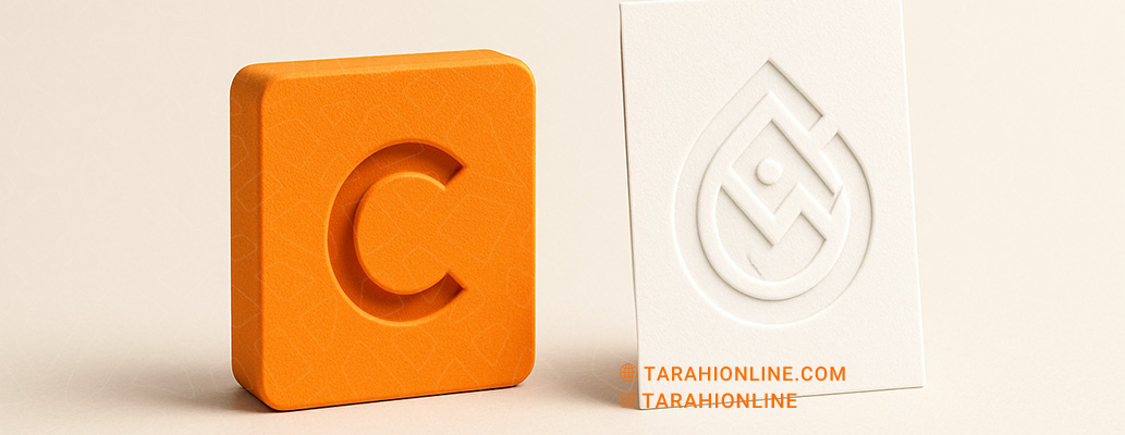
In the competitive world of branding, a logo serves as the heart of a brand’s visual identity, playing a pivotal role in capturing attention and forging connections with audiences. In recent years, there has been a marked shift toward minimalist logo designs, with major brands like Apple, Nike, and Google embracing simplicity. But why are minimalist logos more effective than complex ones? This article explores the reasons why minimalist designs outperform their intricate counterparts.
1. Instant Attention-Grabbing
In a world where audiences are inundated with visual information, a logo must capture attention in an instant. Minimalist logos, by stripping away unnecessary details and focusing on core elements, convey a brand’s message swiftly. Unlike complex logos that may overwhelm or confuse, minimalist designs with clean lines and clear shapes create an immediate impact on the viewer’s mind.
For example, Nike’s simple swoosh communicates movement and success without needing further explanation. This simplicity ensures the logo registers in the audience’s mind within a fraction of a second.
2. Easier to Remember
Minimalist logos are more memorable due to their simplicity. The human brain naturally gravitates toward simple, recognizable patterns. Complex logos with excessive details can be harder to recall, as they require the mind to process more information.
Apple’s logo, a single bitten apple, is a standout example of a minimalist design that is effortlessly memorable. This memorability strengthens brand recognition, enabling audiences to quickly associate the logo with the brand.
3. Versatility Across Media
Minimalist logos, with their streamlined designs and minimal details, perform better across various media. They maintain clarity and legibility in small sizes (like app icons) or large formats (like billboards), as well as in print or digital contexts. In contrast, complex logos may lose detail when scaled down or printed in monochrome.
For instance, Twitter’s simplified bird logo works seamlessly across media, from phone screens to print advertisements. This versatility ensures the brand maintains visual consistency at every touchpoint.
4. Timelessness
Minimalist logos are more resilient to changing trends and design fads. Complex logos, often tied to specific trends, may appear dated after a few years, requiring costly redesigns. Minimalist designs, with their focus on fundamental forms and timeless concepts, remain relevant for decades.
Coca-Cola’s logo, for example, has undergone minimal changes over the years and remains one of the most recognizable symbols globally. This longevity reduces redesign costs and fosters a consistent, trustworthy brand image.

5. Stronger Emotional Connection
By eliminating extraneous elements, minimalist logos convey a brand’s message and values clearly and directly. This clarity helps forge a stronger emotional connection with the audience, as their focus remains on the core concept without distractions.
For example, UNICEF’s logo, featuring a simple image of a mother and child within a circle, universally communicates care and support. This emotional resonance allows the brand to connect with audiences across diverse cultures and backgrounds.
6. Alignment with Modern Trends
Minimalism has become a dominant trend in modern design. Today’s audiences, particularly younger generations, gravitate toward clean, uncluttered aesthetics. Brands with minimalist logos appear more contemporary and professional. For instance, Mastercard’s logo redesign, which removed text to focus on two simple circles, aligns with this trend.
Complex logos, on the other hand, may appear cluttered or outdated, while minimalist designs convey freshness and sophistication.
7. Cost-Effective Production
From a practical perspective, minimalist logos are less expensive to produce and reproduce. Complex designs with multiple colors and intricate details can be costly to print, engrave, or display across media. Minimalist logos, with limited colors and simple lines, are easier and more cost-effective to use in marketing materials.
This is particularly advantageous for small businesses or startups with limited budgets.
Practical Tips for Designing a Minimalist Logo
To create an effective minimalist logo, consider these tips:
-
Focus on a Core Idea: The logo should convey a single, clear concept or brand value.
-
Use Simple Shapes: Geometric forms like circles, squares, and straight lines provide a strong foundation for minimalism.
-
Limit the Color Palette: Use one or two primary colors for cohesion and clarity.
-
Choose Simple Fonts: Sans-serif fonts are ideal for readability and a modern look.
-
Test Across Scales: Ensure the logo remains clear in both small and large formats.
Minimalist logos are more effective than complex ones due to their ability to grab attention quickly, be easily remembered, adapt across media, remain timeless, create strong emotional connections, align with modern trends, and reduce production costs. In a world where audience attention is a precious commodity, a minimalist logo can help a brand stand out in a crowded market and build a powerful, lasting identity. By embracing minimalist principles, designers can create logos that are not only impactful today but also enduring for years to come.
The Tarahi Online graphic and logo design team, with over ten years of experience in professional graphic and logo design, is ready to assist you and bring your ideas to life. Contact us to submit your request or place an order.

