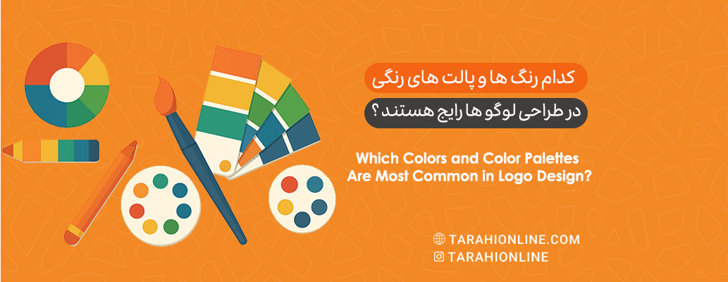
Logo design is a critical aspect of branding that profoundly impacts a brand’s visual identity and audience perception. The choice of color in logo design plays a pivotal role in conveying messages, emotions, and brand values. This article explores the most common colors and color palettes in logo design, their reasons for popularity, and their psychological and cultural impacts.
The Importance of Color in Logo Design
Colors are more than just visual elements; they are powerful tools for communication and evoking emotions. Each color carries specific meanings and associations that can vary based on culture, industry, and target audience. In logo design, colors should:
-
Align with the brand’s values and personality.
-
Be memorable and distinctive in the audience’s mind.
-
Perform well across various media (print, digital, etc.).
Common Colors in Logo Design
Based on research and analysis in graphic design and branding, certain colors are widely used in logo design due to their visual and psychological properties. Below, we explore these colors and the reasons for their popularity:
1. Blue
-
Popularity: Blue is one of the most commonly used colors in logo design. Major brands like IBM, Intel, Facebook, and Samsung utilize blue.
-
Reasons for Popularity:
-
Trust and Professionalism: Blue symbolizes trust, reliability, and stability, making it ideal for technology, finance, and insurance companies.
-
Versatility: Blue works well across its spectrum (from sky blue to navy) and pairs effectively with most other colors.
-
Global Appeal: Blue carries positive connotations across cultures and is rarely associated with negative emotions.
-
-
Applications: Logos for tech companies, banks, and professional organizations.
2. Red
-
Popularity: Red is a vibrant and energetic color seen in logos of brands like Coca-Cola, Netflix, and Canon.
-
Reasons for Popularity:
-
Attention-Grabbing: Red’s high visual intensity quickly captures attention.
-
Strong Emotions: Associated with passion, excitement, and energy, red is perfect for brands aiming to appear bold and dynamic.
-
Industry Flexibility: Red is popular in food, entertainment, and retail industries.
-
-
Applications: Logos for restaurants, fashion brands, and entertainment companies.
3. Black
-
Popularity: Black is a classic and powerful color used in logos of luxury brands like Chanel, Nike, and Adidas.
-
Reasons for Popularity:
-
Simplicity and Elegance: Black creates a minimalist and sophisticated look, ideal for luxury and modern brands.
-
Versatility: It works well as a primary or complementary color alongside others.
-
Strength and Authority: Black conveys power, control, and professionalism.
-
-
Applications: Logos for fashion, technology, and luxury products.
4. White
-
Popularity: White is often used as a background or in combination with other colors in logos of brands like Apple and Tesla.
-
Reasons for Popularity:
-
Simplicity and Purity: White symbolizes cleanliness, purity, and modernity.
-
Flexibility: As a neutral color, white pairs well with any color and is highly effective in minimalist designs.
-
Highlighting Other Elements: White allows other logo elements (like typography or primary colors) to stand out.
-
-
Applications: Logos for tech, fashion, and lifestyle brands.
5. Green
-
Popularity: Green is featured in logos of brands like Starbucks, Spotify, and Whole Foods.
-
Reasons for Popularity:
-
Nature and Sustainability: Green is associated with the environment, growth, and health, making it suitable for eco-friendly and organic brands.
-
Calming Effect: This color conveys tranquility and balance.
-
Spectrum Variety: From olive to mint, green is versatile across its shades.
-
-
Applications: Logos for environmental companies, organic foods, and tech brands.
6. Yellow
-
Popularity: Yellow appears in logos of brands like McDonald’s, IKEA, and Snapchat.
-
Reasons for Popularity:
-
Joy and Energy: Yellow symbolizes optimism, creativity, and happiness.
-
Attention-Grabbing: Its brightness quickly draws the eye.
-
Friendliness: Yellow conveys accessibility and warmth.
-
-
Applications: Logos for fast-food restaurants, creative brands, and youth-oriented companies.
Common Color Palettes in Logo Design
In addition to individual colors, color palettes (color combinations) play a significant role in logo design. Common palettes include:
1. Monochromatic Palette
-
Characteristics: Uses a single color with various shades and tints (e.g., Spotify’s green spectrum).
-
Advantages:
-
Cohesive and professional appearance.
-
Simple and memorable.
-
Ideal for minimalist brands.
-
-
Applications: Tech and lifestyle brands.
2. Complementary Palette
-
Characteristics: Uses two colors opposite each other on the color wheel (e.g., red and green or blue and orange).
-
Advantages:
-
High contrast and attention-grabbing.
-
Conveys dynamism and excitement.
-
-
Applications: Entertainment and retail brands.
3. Analogous Palette
-
Characteristics: Uses colors adjacent to each other on the color wheel (e.g., blue, green, and teal).
-
Advantages:
-
Visually harmonious and calming.
-
Suitable for creative and natural brands.
-
-
Applications: Environmental and health brands.
4. Triadic Palette
-
Characteristics: Uses three colors evenly spaced on the color wheel (e.g., red, yellow, and blue).
-
Advantages:
-
Balanced and vibrant.
-
Conveys creativity and playfulness.
-
-
Applications: Children’s and entertainment brands.
5. Neutral Palette
-
Characteristics: Uses neutral colors like black, white, gray, and beige.
-
Advantages:
-
Timeless and elegant appearance.
-
Suitable for luxury and professional brands.
-
-
Applications: Fashion and high-tech brands.
Cultural and Industry Influences
Color choices in logo design are heavily influenced by culture and industry:
-
Culture: Colors carry different meanings across cultures. For example, white symbolizes purity in Western cultures but is associated with mourning in some Eastern cultures.
-
Industry:
-
Technology: Blue and white for trust and innovation.
-
Food: Red and yellow to stimulate appetite.
-
Luxury: Black and gold for elegance and exclusivity.
-
Environmental: Green for sustainability and nature.
-
Current Trends in Logo Color Choices
Recent years have seen emerging trends in logo color choices:
-
Gradients: Using gradients (e.g., Instagram’s logo) for a modern and dynamic feel.
-
Neon Colors: Bright, neon colors to appeal to younger audiences.
-
Minimalism: Monochromatic or neutral palettes for simplicity and elegance.
-
Unconventional Colors: Brands increasingly use unusual colors like purple or pink to stand out.
Key Considerations in Choosing Logo Colors
-
Know Your Audience: Colors should resonate with the preferences and expectations of the target audience.
-
Test Across Media: Ensure colors perform well in print, digital, and other environments.
-
Balance Distinction and Harmony: The logo should stand out while aligning with the brand’s overall identity.
-
Consider Color Psychology: Be aware of the emotional and cultural impacts of colors.
Choosing colors and color palettes in logo design is a strategic decision that requires a deep understanding of the brand, audience, and market. Blue, red, black, white, green, and yellow are among the most popular colors due to their visual and psychological properties. Monochromatic, complementary, analogous, and neutral palettes are widely used for their flexibility and visual impact. By considering current trends, cultural influences, and industry needs, designers can create logos that are not only visually appealing and memorable but also effectively convey the brand’s message.

The Tarahi Online graphic and logo design team, with over ten years of experience in professional graphic and logo design, is ready to assist you and bring your ideas to life. Contact us to submit your request or place an order.