Colors are among the most powerful tools in graphic design. They not only capture attention but also convey emotions, values, and specific messages. In graphic design, choosing the right color can strengthen a brand’s identity, evoke emotions in the audience, or even influence their behavior. But what does each color signify, and how can they be used effectively in design? This article explores the psychological, cultural, and practical meanings of colors in graphic design and provides guidance on their optimal use.
The Psychology of Colors in Graphic Design
Colors have a profound impact on human emotions and perceptions. Understanding color psychology helps designers convey intended messages effectively. Below, we examine the meanings and applications of key colors:
1. Red
- Meaning: Red is a passionate, energetic, and attention-grabbing color. It is associated with emotions like love, anger, danger, and excitement.
- Application in Design: Red is ideal for capturing immediate attention, such as in call-to-action (CTA) buttons or sale advertisements. Brands like Coca-Cola use red to convey energy and vibrancy.
- Considerations: Overusing red can evoke anxiety, so it should be used sparingly and purposefully.
2. Blue
- Meaning: Blue symbolizes trust, calmness, professionalism, and stability. It is often linked to technology and security.
- Application in Design: Blue is popular in logos for tech companies like IBM and Facebook, as well as in health and financial designs, as it instills confidence and reliability.
- Considerations: Darker blues convey formality, while lighter blues feel friendly and approachable.
3. Yellow
- Meaning: Yellow is a cheerful, optimistic, and creative color. It is associated with positive energy, youth, and creativity.
- Application in Design: Yellow is effective for attracting attention and evoking optimism in brands related to children, food, or creativity, such as McDonald’s.
- Considerations: Overly bright yellow can strain the eyes, so it’s best paired with neutral tones.
4. Green
- Meaning: Green represents nature, growth, health, and sustainability. It conveys a sense of calm and balance.
- Application in Design: Green is widely used in brands tied to the environment, organic products, or health, like Starbucks. Dark green suggests luxury, while lighter green conveys freshness.
- Considerations: The shade of green should align with the brand’s message to avoid appearing immature.
5. Orange
- Meaning: Orange combines the energy of red and the cheerfulness of yellow. It is associated with creativity, adventure, and friendliness.
- Application in Design: Orange is suitable for energetic, youth-oriented brands like Fanta or Nickelodeon. It’s often used in digital designs to create an inviting feel.
- Considerations: Orange should be balanced to avoid appearing unprofessional.
6. Purple
- Meaning: Purple symbolizes creativity, luxury, and mystery. It is often linked to royalty and imagination.
- Application in Design: Purple is used in luxury, beauty, and creative brands, such as Cadbury. Lighter purples evoke playfulness, while darker shades suggest sophistication.
- Considerations: Purple may feel unconventional for some audiences, so it requires careful application.
7. Black
- Meaning: Black represents power, elegance, and modernity. It conveys a sense of mystery and authority.
- Application in Design: Black is popular in luxury brands like Chanel and minimalist designs. It’s also used as a background to highlight other colors.
- Considerations: Excessive use of black can feel heavy or depressing, so moderation is key.
8. White
- Meaning: White symbolizes simplicity, purity, and cleanliness. It conveys a sense of minimalism and clarity.
- Application in Design: White is used in minimalist and tech designs, like Apple’s branding, to create a modern, clean aesthetic. It also serves as negative space for visual balance.
- Considerations: White alone may seem cold or empty, so it benefits from pairing with other colors.
9. Gray
- Meaning: Gray symbolizes neutrality, professionalism, and balance. It conveys calmness and impartiality.
- Application in Design: Gray is often used as a complementary color in modern and minimalist designs, particularly for tech or financial brands.
- Considerations: Too much gray can feel dull, so it should be paired with vibrant colors.
10. Brown
- Meaning: Brown represents warmth, reliability, and nature. It conveys strength and comfort.
- Application in Design: Brown is used in brands related to natural products, like coffee or wood, such as UPS.
- Considerations: Brown can seem dated or conservative unless paired with modern colors.
Cultural Influences of Colors
The meaning of colors varies across cultures, and designers must consider these differences:
- Red: In Western cultures, it signifies love and excitement, but in some Eastern cultures, like China, it represents luck and prosperity.
- White: In the West, it symbolizes purity and weddings, but in many Eastern cultures, it is associated with death and mourning.
- Purple: In Western cultures, it’s linked to creativity and luxury, but in some Asian cultures, it may be associated with mourning.
- Blue: Generally conveys trust and calmness across most cultures, though its intensity may vary.
Designers working for global audiences must research cultural meanings to avoid unintended messages.
Practical Applications of Colors in Graphic Design
1. Branding
Colors play a critical role in shaping a brand’s visual identity. For example, Coca-Cola’s red conveys vibrancy, while Twitter’s blue suggests trust and connectivity. Color choices should align with a brand’s values and personality.
2. Call-to-Action (CTA)
Bold colors like red, orange, and yellow are effective for CTA buttons in websites and ads, as they draw attention and create a sense of urgency.
3. Visual Balance
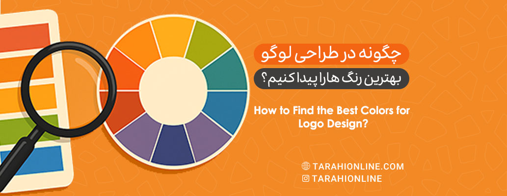
Combining complementary or contrasting colors (e.g., blue and orange) creates visual harmony. Using the color wheel to select harmonious combinations, such as analogous colors (e.g., blue and green) or triadic schemes (e.g., red, yellow, blue), adds depth and appeal to designs.
4. Accessibility
Designers must ensure color combinations are distinguishable for people with visual impairments, such as color blindness. Sufficient contrast between text and background (e.g., black on white) is essential for readability.
Color Trends in Graphic Design
Color trends are leaning toward bold yet balanced palettes:
- Nature-Inspired Palettes: Colors like forest greens and warm browns are popular for conveying sustainability.
- Soft Gradients: Gentle color transitions (e.g., blue to purple) create a modern, dynamic feel.
- Balanced Neons: Softer neon shades paired with neutrals for visually striking yet approachable designs.
- Digital Tools: AI-powered design tools help create color palettes tailored to audience psychology.
Challenges of Using Colors
- Over-Saturation: Excessive use of bright colors can overwhelm viewers.
- Cultural Misalignment: Choosing colors without considering cultural context can convey unintended messages.
- Technical Limitations: Some colors may appear differently in print or on digital screens, requiring testing across mediums.
Colors in graphic design go beyond aesthetics; they are tools for conveying emotions, values, and brand identity. Understanding the psychological and cultural meanings of colors, combined with strategic application, enables designers to create impactful and lasting designs. With 2025 trends emphasizing sustainability, personalization, and technology, choosing the right colors is more critical than ever. By blending color psychology with audience needs, designers can craft visuals that are not only beautiful but also meaningful and effective.

The Tarahi Online graphic and logo design team, with over ten years of experience in professional graphic and logo design, is ready to assist you and bring your ideas to life. Contact us to submit your request or place an order.