A color gradient, often referred to simply as a gradient, is a popular technique in graphic design, logo creation, and user interface design that involves a smooth transition between two or more colors. This approach creates visually appealing, dynamic, and modern effects, making it a trending choice in contemporary design. In this article, we’ll explore the definition of color gradients, their types, applications, and key tips for using them effectively in design.
What is a Color Gradient?
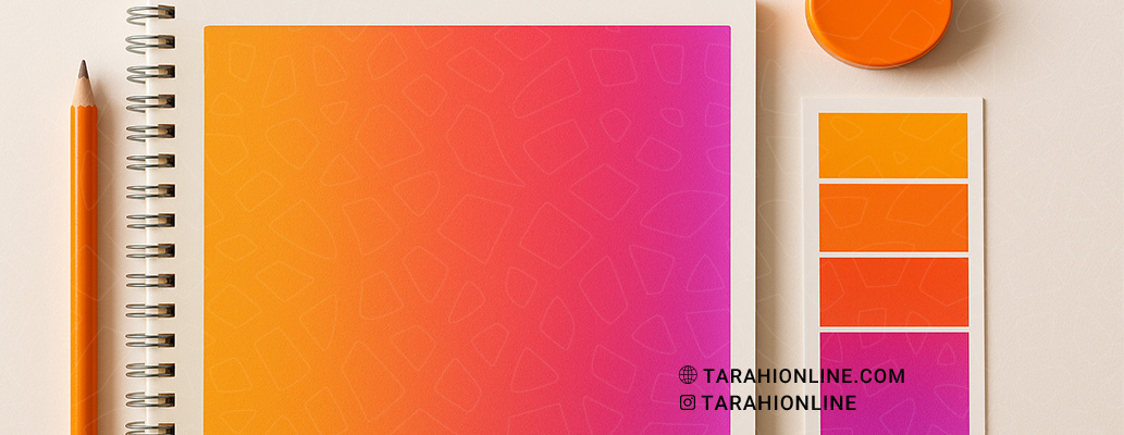
A color gradient is the gradual transition of colors from one point to another, creating a seamless blend. This transition can occur between two colors (e.g., blue to red) or multiple colors, resulting in a smooth, continuous effect. Gradients can be linear, radial, or angular, adding depth, movement, or energy to a design.
Types of Color Gradients
Gradients can be categorized based on their shape and the way colors transition:
-
Linear Gradient: Colors transition in a straight line (horizontal, vertical, or diagonal). This type is ideal for backgrounds or simple logo designs.
-
Radial Gradient: Colors radiate outward from a central point, resembling sunlight. This is great for creating focus or depth.
-
Angular Gradient: Colors shift in an angular or conical path, which is less common but highly creative.
-
Freeform Gradient: Colors blend in a non-linear, freeform manner across different points, suitable for more complex designs.
Applications of Color Gradients
Color gradients are widely used across various design fields:
-
Logo Design: Gradients add a sense of dynamism and modernity to logos. For instance, Instagram’s logo uses a gradient to create a vibrant, youthful look.
-
User Interface (UI) Design: In apps and websites, gradients are used for buttons, backgrounds, and icons to enhance user experience.
-
Advertising and Branding: Gradients can convey energy, creativity, or sophistication in marketing materials.
-
Digital Graphics: In posters, banners, and social media visuals, gradients boost visual appeal.
Benefits of Using Color Gradients
-
Visual Appeal: Gradients make designs stand out by adding depth and avoiding flatness.
-
Flexibility: They can be adapted to various design styles, from minimal to modern or classic.
-
Emotional Impact: Specific color combinations can evoke emotions like calmness, excitement, or professionalism.
-
Digital Compatibility: Gradients perform well on digital displays, maintaining quality across different resolutions.
Key Tips for Using Color Gradients
-
Choose Appropriate Colors: Select colors that align with your brand’s identity. Tools like Adobe Color or Coolors can help create cohesive palettes.
-
Maintain Balance: Overly complex gradients can clutter a design. Stick to 2–4 colors for clarity.
-
Ensure Contrast: Verify that the gradient remains legible on both light and dark backgrounds.
-
Test Across Platforms: Ensure the gradient looks good in both small (e.g., icons) and large formats (e.g., banners).
-
Draw Inspiration from Nature: Gradients inspired by natural phenomena, like sunsets or skies, tend to be more appealing.
Successful Examples of Color Gradients
Brands like Instagram, Spotify, and Apple have effectively used gradients in their logos and products. For example, Instagram’s colorful gradient not only feels modern but also conveys creativity and diversity.
Color gradients are a powerful tool for adding depth, appeal, and modernity to graphic designs. By carefully selecting colors, choosing the right gradient type, and maintaining balance in your design, you can leverage this technique to enhance your brand’s visual identity, capture audience attention, and create memorable designs. When used correctly, gradients can transform an ordinary design into something extraordinary.

The Tarahi Online graphic and logo design team, with over ten years of experience in professional graphic and logo design, is ready to assist you and bring your ideas to life. Contact us to submit your request or place an order.