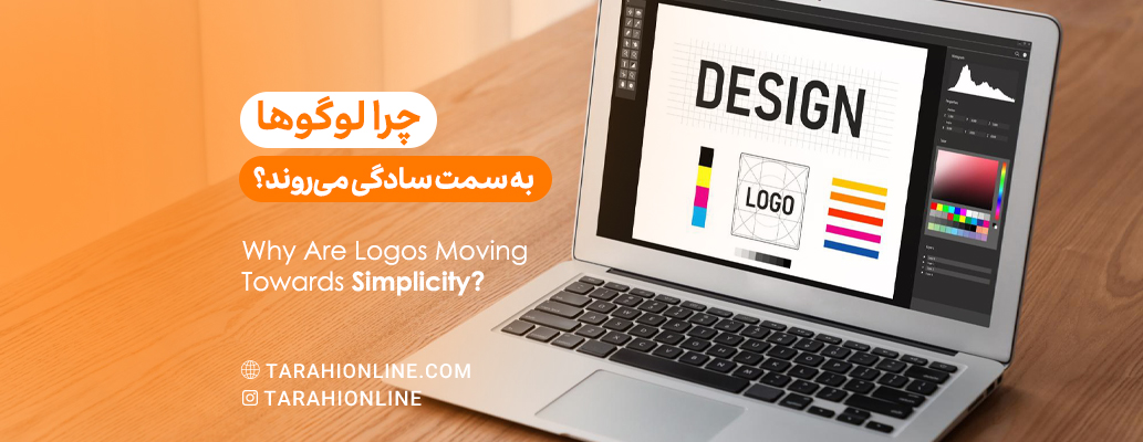
In the world of graphic design and branding, a clear trend has emerged in recent years: the move towards simplicity in logo design. Many of the world's famous brands, from Google and Apple to Starbucks and Mastercard, have simplified their logos. But why is this happening? In this article, we'll explore the main reasons behind this trend.
1. Adaptation to the Digital World
One of the most important reasons for the move towards simplicity is the need to adapt to digital environments. In the age of smartphones and small-screen devices, logos need to be recognizable in various sizes, from small app icons to large billboards. Simpler logos perform better in this regard.
Example: Apple's logo, consisting of a simple apple, is easily recognizable at any size.
2. Better Readability and Memorability
Simple logos are usually more readable and easier to remember. In a world where we encounter hundreds of brands and logos daily, having a simple and memorable logo can be a big advantage for a brand.
Example: Nike's logo, consisting of just a simple "swoosh," is one of the most memorable logos in the world.
3. Quick Message Delivery
In the information age, audience attention span is very short. Simple logos can convey the brand's message faster and more effectively. They allow the audience to quickly connect without the need to interpret complex details.
Example: McDonald's logo, with its simple golden arches, is quickly recognizable and conveys the concept of fast food.
4. Greater Flexibility
Simple logos are more flexible in use. They can be more easily used in various media, from print to digital and even 3D environments. Also, changing colors or applying different effects to simple logos is easier.
Example: Google's logo, despite its simplicity, can easily change for various occasions (Google Doodles).
5. Alignment with Modern Design Principles
Modern design, especially in the digital world, emphasizes the principle of "less is more." This philosophy is also seen in web design, user interface, and even architecture. Simple logos are more in line with these principles and make the brand appear modern and up-to-date.
Example: Microsoft's new logo, consisting of four simple squares, is an example of this modern approach.
6. Reduction in Printing and Production Costs
Practically, simpler logos usually have lower printing and production costs. They can be printed with fewer colors and cost less in producing promotional products such as t-shirts or advertising items.
Example: Twitter's logo, which uses only one blue color, is easily printable and producible.
7. Focus on Brand Identity
Simple logos allow brands to focus on the core essence of their identity. Instead of drawing attention to complex details, they display the brand's core values in a pure and unadorned form.
Example: Airbnb's new logo, consisting of a simple symbol called "Bélo," depicts the concept of "belonging" which is at the heart of this brand's identity.
8. Alignment with Modern Consumer Tastes
Today's consumers, especially younger generations, have a greater preference for simple and minimalist designs. This preference is seen not only in logos but also in product design, architecture, and even lifestyle. Brands align with this taste by simplifying their logos.
Example: The new logo of the luxury brand Yves Saint Laurent (YSL), which has changed to a very simple and modern design.
9. Emphasis on Brand Essence
Simple logos allow brands to emphasize their core essence without distractions. By stripping away unnecessary elements, brands can communicate their fundamental values and propositions more clearly.
Example: The FedEx logo, with its hidden arrow in the negative space between 'E' and 'x', cleverly communicates speed and precision with a simple design.
10. Cross-Cultural Compatibility
As brands become increasingly global, simple logos offer better cross-cultural compatibility. They are less likely to have elements that might be misinterpreted or considered offensive in different cultural contexts.
Example: The Mastercard logo, which uses simple overlapping circles, is easily recognizable and meaningful across various cultures.
11. Faster Load Times in Digital Environments
In the digital realm, simpler logos typically have smaller file sizes, leading to faster load times on websites and apps. This is particularly important for user experience and SEO performance.
Example: The simple, text-based logo of Facebook loads quickly across various platforms and devices.
12. Easier Animation and Interaction
Simple logos are easier to animate for digital platforms and interactive media. This flexibility allows brands to create engaging content for social media, websites, and video productions.
Example: Google's simple letter-based logo lends itself well to various animations and interactive doodles on their homepage.
13. Adaptation to Voice and AI Interfaces
As voice-activated devices and AI interfaces become more prevalent, simple logos that are easy to describe verbally gain an advantage. This simplicity aids in brand recall even in non-visual interactions.
Example: Amazon's simple smile logo is easy to describe and recognize, even when interacting with Alexa or other voice assistants.
The move towards simplicity in logo design is not a random trend. It's a response to the practical needs of the modern world, changes in consumer preferences, and contemporary design principles. However, it should be noted that simplicity does not mean lack of value or creativity. On the contrary, designing a simple yet effective logo requires high skill and creativity.
Ultimately, the goal of logo design is to create a powerful and lasting symbol for the brand. If this goal is better achieved with a simple design, then the move towards simplicity is entirely logical. Nevertheless, each brand must decide how much simplicity is appropriate for its identity, values, and audience.